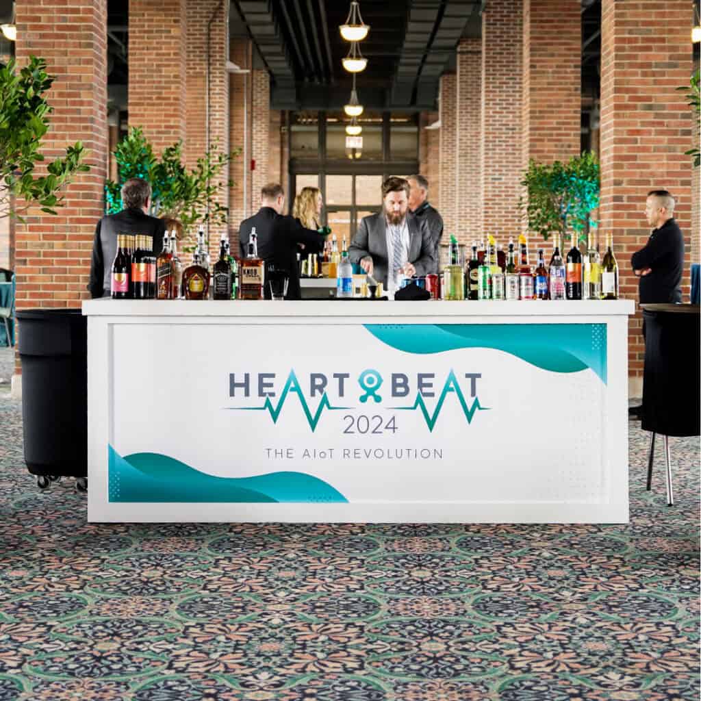
Powerfleet Heartbeat 2024 was the company’s second annual customer conference, bringing customers, partners, and internal teams together in Chicago for two days of product education, industry discussion, and connection.
The identity needed to feel distinct from the broader Powerfleet brand while still belonging within it. It also had to scale across a wide range of physical and digital touchpoints, from registration and session materials to environmental graphics, kiosks, and the event hub.
The project was developed in collaboration with Brand and Communications, Events, Content, and other internal stakeholders. My role focused on leading the visual direction, designing the event identity and supporting system, and carrying that system across many of the attendee-facing applications.
ROLE
Senior Graphic Designer, Powerfleet
TIMELINE
5 months, 2024
TOOLS
Illustrator, InDesign, Photoshop, Adobe XD
FOCUS
Event identity, environmental graphics, print, digital collateral, onsite support
Powerfleet Heartbeat
Powerfleet Heartbeat 2024 was the company’s second annual customer conference, bringing customers, partners, and internal teams together in Chicago for three days of product education, industry discussion, and connection.
The identity needed to feel distinct from the broader Powerfleet brand while still belonging within it. It also had to scale across a wide range of physical and digital touchpoints, from registration and session materials to environmental graphics, kiosks, and the event hub.
The project was developed in collaboration with Brand and Communications, Events, Content, and other internal stakeholders. My role focused on leading the visual direction, evolving the event identity for its second year, and carrying the system across many of the attendee-facing applications.
ROLE
Senior Graphic Designer, Powerfleet
TIMELINE
5 months, 2024
TOOLS
Illustrator, InDesign, Photoshop, Adobe XD
FOCUS
Event identity, environmental graphics, print, digital collateral, onsite support
Powerfleet Heartbeat 2024 was the company’s second annual customer conference, bringing customers, partners, and internal teams together in Chicago for three days of product education, industry discussion, and connection.
The identity needed to feel distinct from the broader Powerfleet brand while still belonging within it. It also had to scale across a wide range of physical and digital touchpoints, from registration and session materials to environmental graphics, kiosks, and the event hub.
The project was developed in collaboration with Brand and Communications, Events, Content, and other internal stakeholders. My role focused on leading the visual direction, evolving the event identity for its second year, and carrying the system across many of the attendee-facing applications.
ROLE
Senior Graphic Designer, Powerfleet
TIMELINE
5 months, 2024
TOOLS
Illustrator, InDesign, Photoshop, Adobe XD, Acrobat
FOCUS
Event identity, environmental graphics, print, digital collateral, onsite support
Logo Design
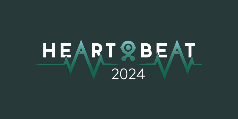
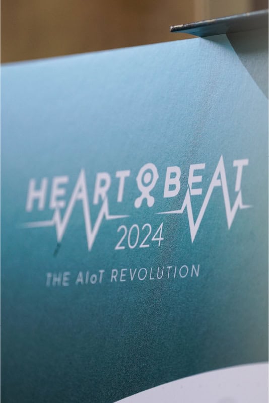
Heartbeat 2024 built on the identity established for the conference’s first year. The core wordmark remained largely unchanged, while the color treatment and supporting visual system were refreshed to give the second event a distinct look.
The logo continued to connect to the heartbeat of the business, its customers, while also reflecting the pulse of the AIoT revolution that shaped the event theme. A custom pulse line moved through the wordmark to reinforce customer connection, innovation, and the energy of the conference.
Updated color variations and lockups helped the identity work consistently across signage, screens, badges, programs, and smaller digital applications.
Logo Design
Heartbeat 2024 built on the identity established for the conference’s first year. The core wordmark remained largely unchanged, while the color treatment and supporting visual system were refreshed to give the second event a distinct look.
The logo continued to connect to the heartbeat of the business, its customers, while also reflecting the pulse of the AIoT revolution that shaped the event theme. A custom pulse line moved through the wordmark to reinforce customer connection, innovation, and the energy of the conference.
Updated color variations and lockups helped the identity work consistently across signage, screens, badges, programs, and smaller digital applications.
Design Language
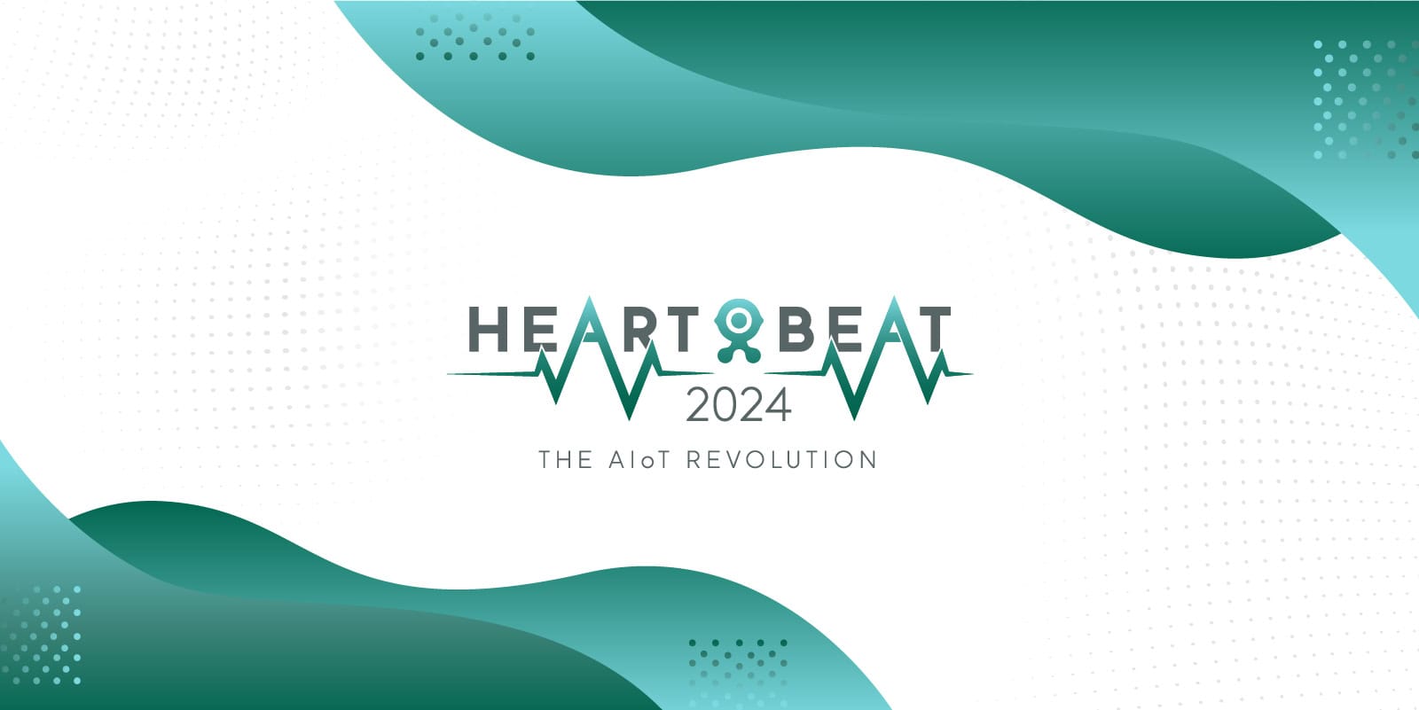
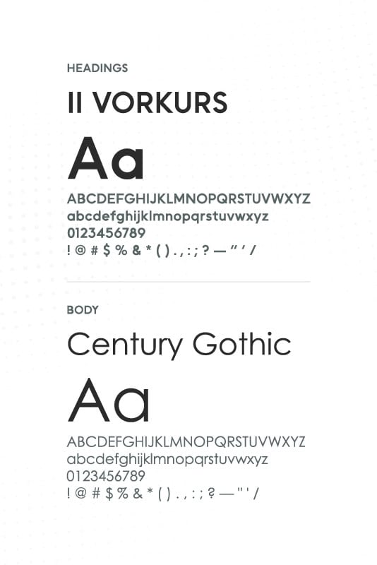
The supporting visual system extended the energy of the logo into a broader event language.
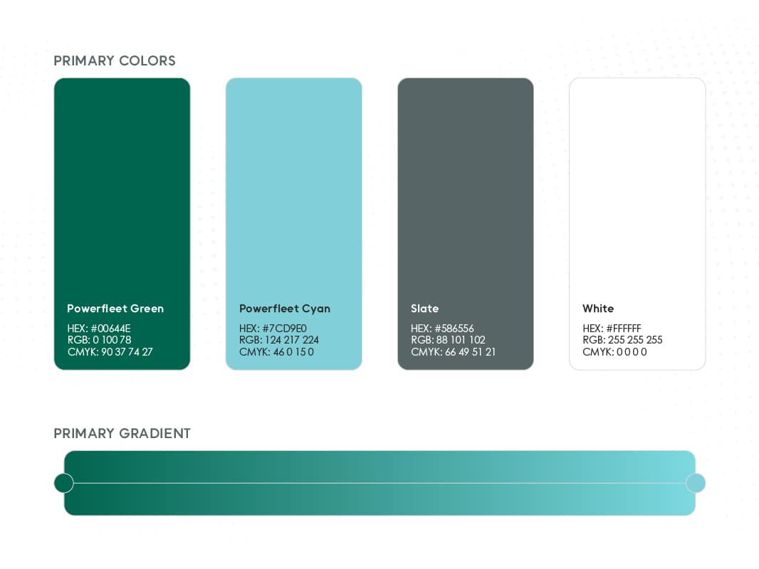
Layered waves, gradients, and data-inspired textures introduced motion and depth while reinforcing themes of technology, connectivity, and transformation. A focused teal and green palette kept the event connected to Powerfleet, while lighter tones and open layouts gave the materials a more welcoming feel.
The system was built around repeatable components rather than fixed templates, allowing each application to respond to its format while still feeling part of the same event.
Design Language
The supporting visual system extended the energy of the logo into a broader event language.
Layered waves, gradients, and data-inspired textures introduced motion and depth while reinforcing themes of technology, connectivity, and transformation. A focused teal and green palette kept the event connected to Powerfleet, while lighter tones and open layouts gave the materials a more welcoming, editorial feel.
The system was built around repeatable components rather than fixed templates, allowing each application to respond to its format while still feeling part of the same event.
In the Wild
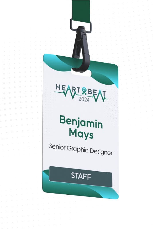
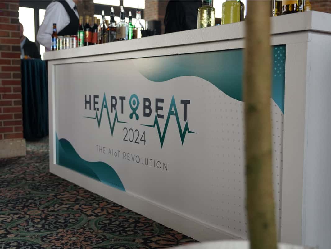
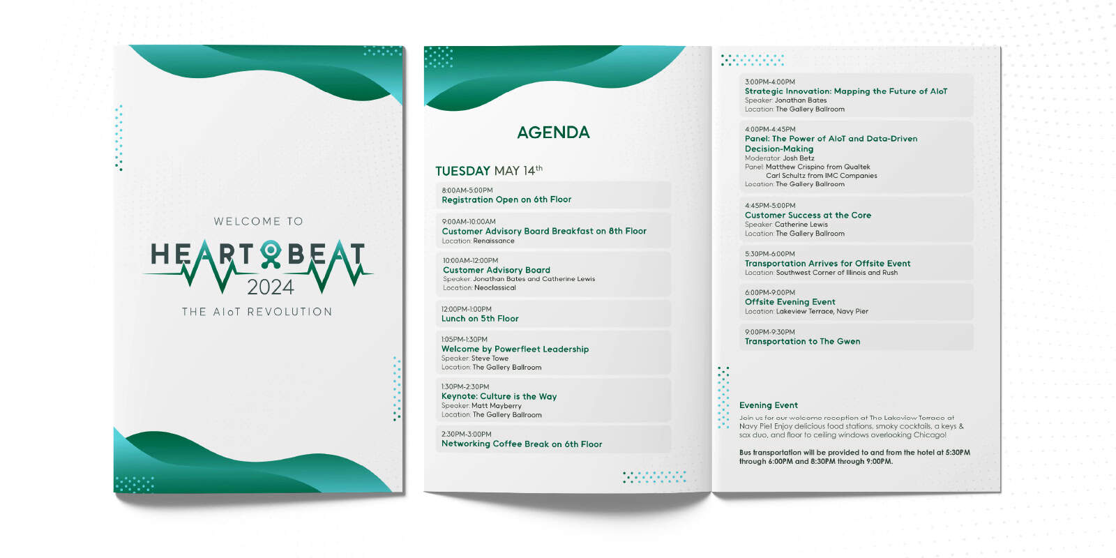
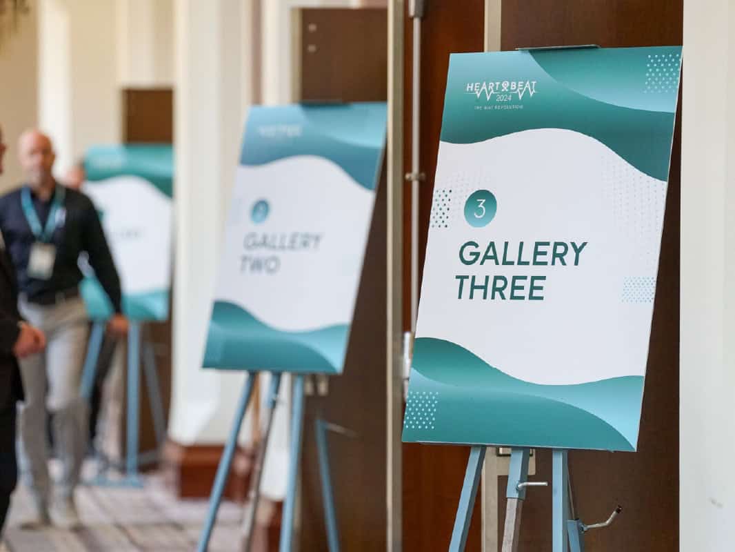
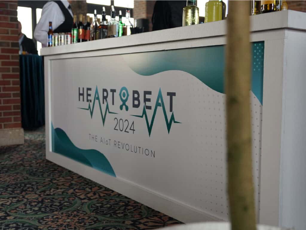
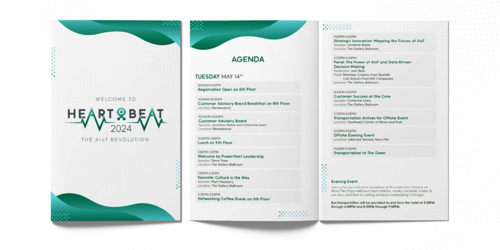
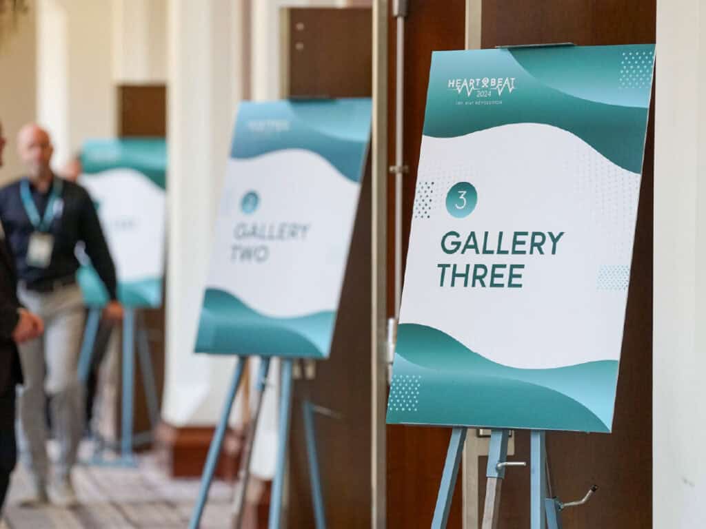
The identity was applied across the full attendee experience, including registration materials, staff badges, programs, session signage, room graphics, presentation screens, and venue branding.
The system needed to do more than create visual consistency. It also had to support navigation, help attendees distinguish between sessions and spaces, and make important information easy to find in a busy event environment.
By using the same hierarchy, graphic elements, and color relationships across each touchpoint, the experience remained connected from arrival through the final session.
In the Wild
The identity was applied across the full attendee experience, including registration materials, staff badges, programs, session signage, room graphics, presentation screens, and venue branding.
The system needed to do more than create visual consistency. It also had to support navigation, help attendees distinguish between sessions and spaces, and make important information easy to find in a busy event environment.
By using the same hierarchy, graphic elements, and color relationships across each touchpoint, the experience remained connected from arrival through the final session.
Innovation Zones
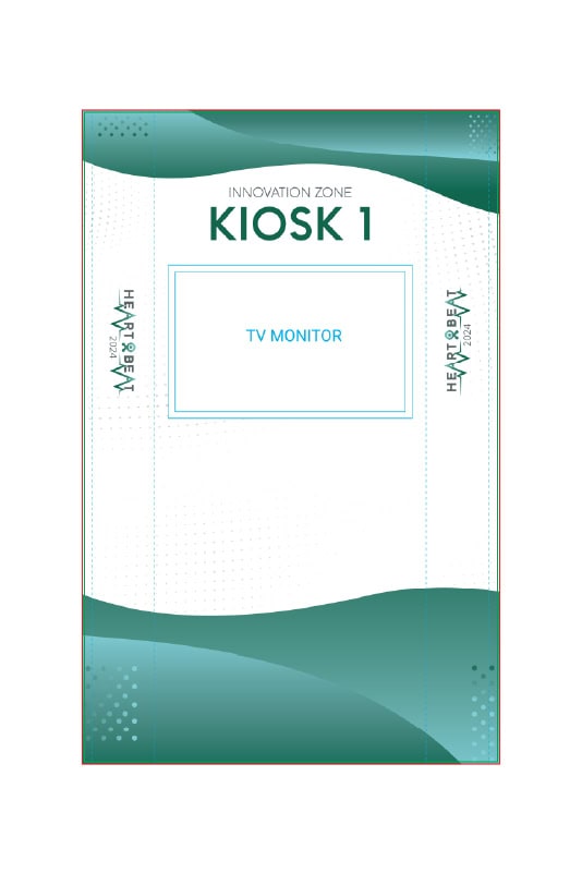
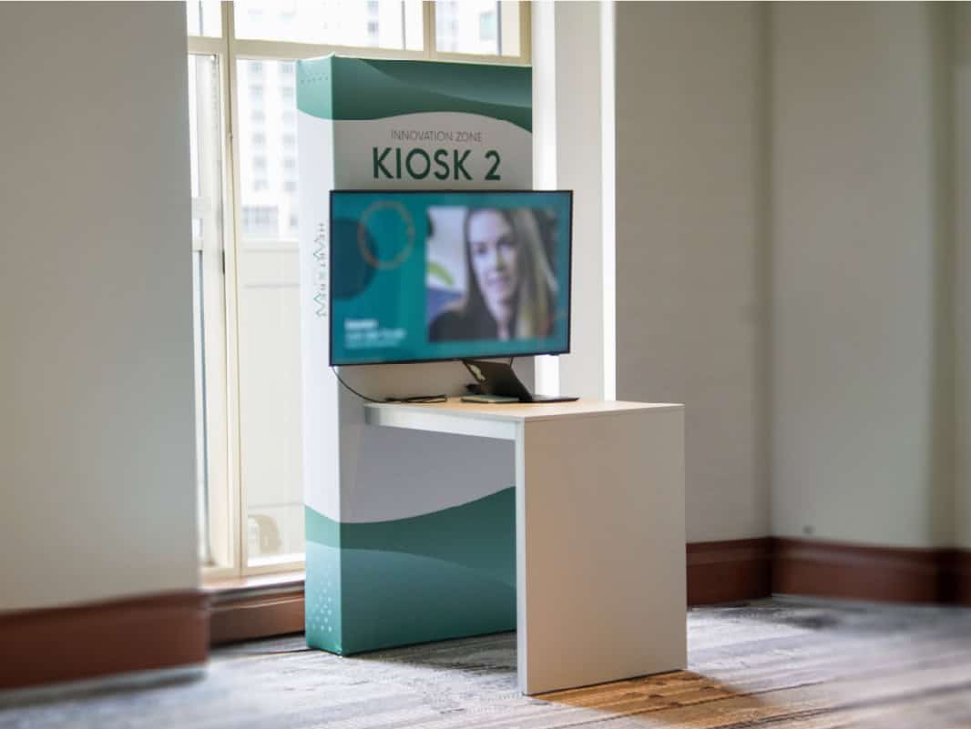
Interactive innovation zones gave attendees a closer look at Powerfleet products and solutions throughout the event.
Each area required clear identification, supporting information, and a visual presence that felt integrated with the wider conference. The Heartbeat system was adapted across kiosk graphics, digital screens, environmental panels, and supporting signage without creating a separate identity for each zone.
This allowed individual experiences to feel distinct while still contributing to one cohesive event environment.
Innovation Zones
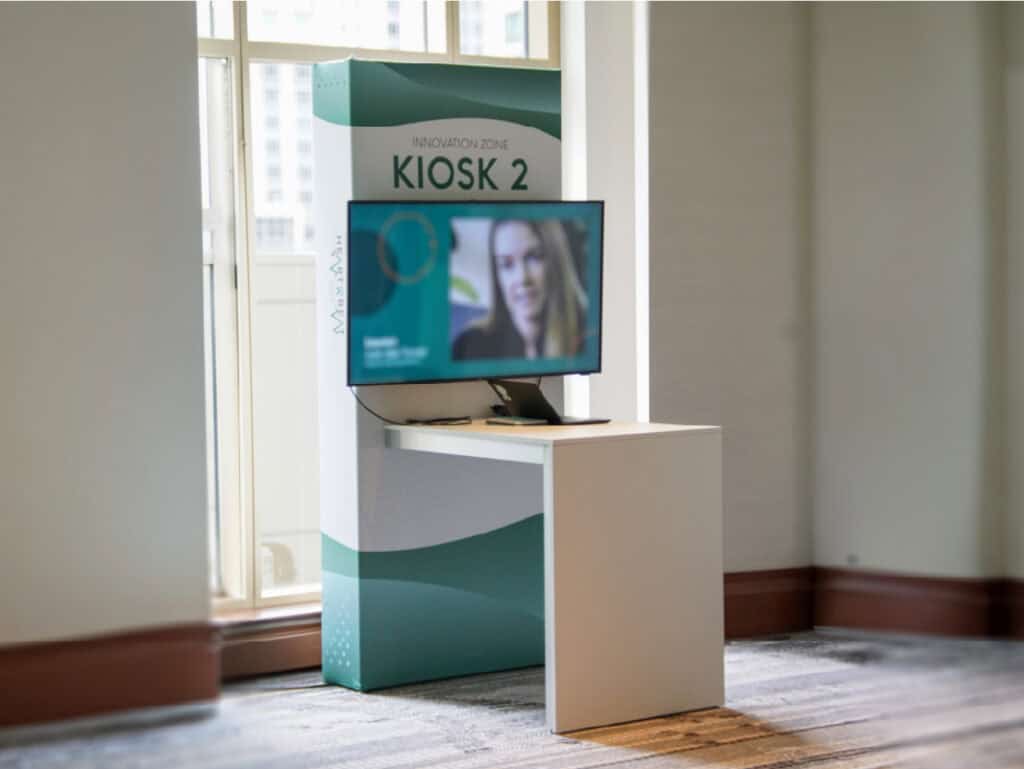
Interactive innovation zones gave attendees a closer look at Powerfleet products and solutions throughout the event.
Each area required clear identification, supporting information, and a visual presence that felt integrated with the wider conference. The Heartbeat system was adapted across kiosk graphics, digital screens, environmental panels, and supporting signage without creating a separate identity for each zone.
This allowed individual experiences to feel distinct while still contributing to one cohesive event environment.
The Hub
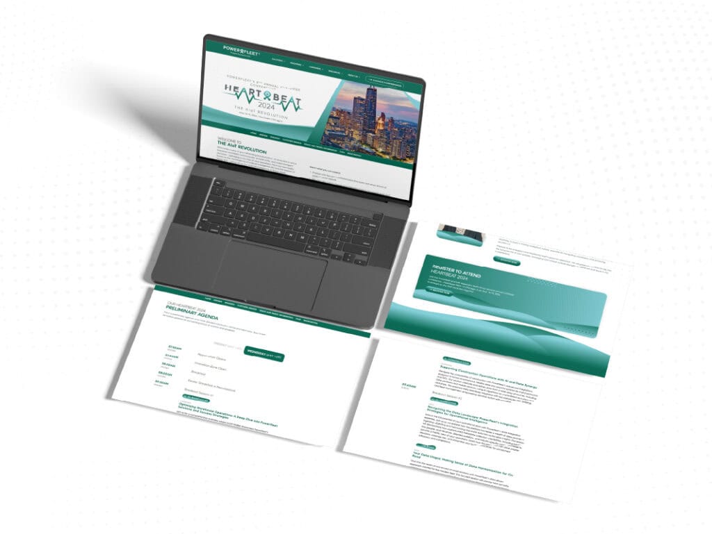
The digital hub extended the event experience beyond the physical venue.
The same identity system was carried into the registration experience, mobile communications, schedules, and supporting digital content. Responsive layouts, simplified hierarchy, and recognizable event elements helped attendees move between physical and digital touchpoints without losing continuity.
The hub also gave the identity another test of flexibility, proving that the system could shift from large-format environmental graphics to compact mobile interfaces while remaining clear and recognizable.
The Hub
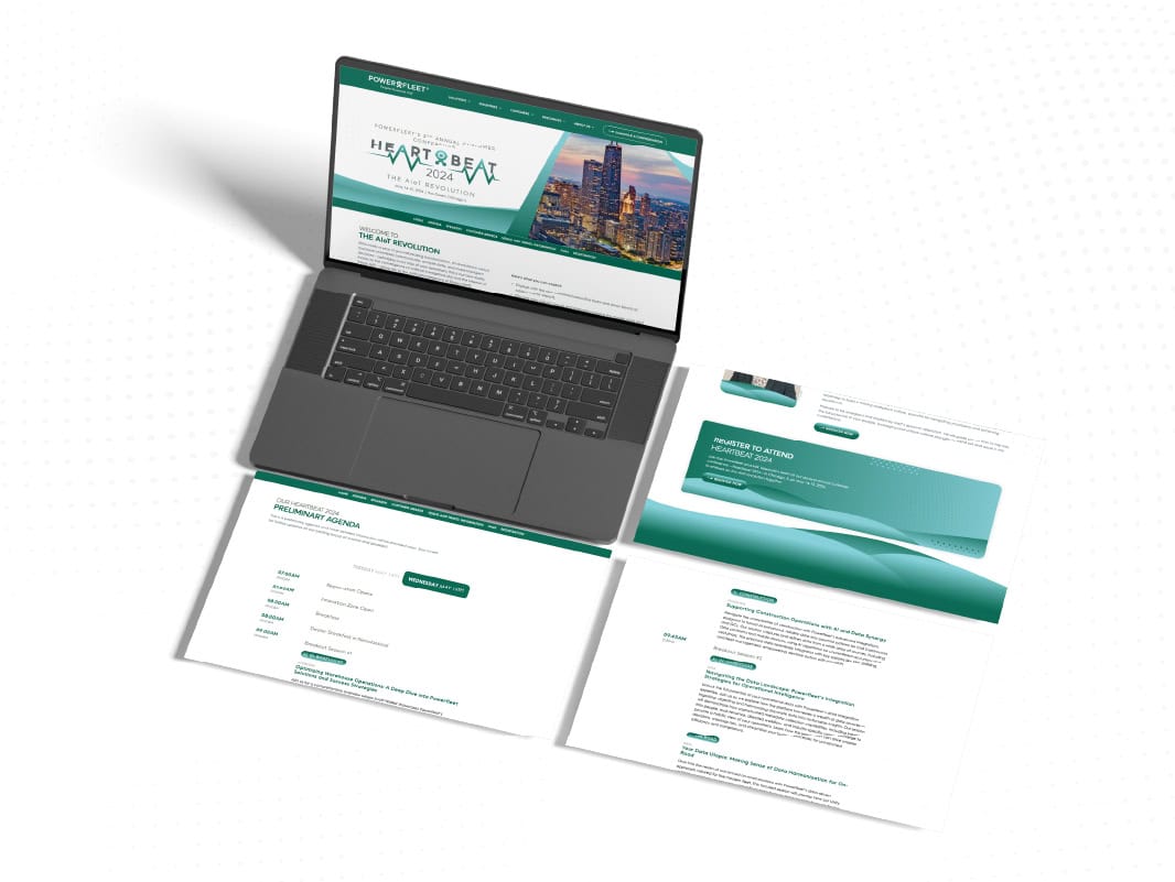
The digital hub extended the event experience beyond the physical venue.
The same identity system was carried into the registration experience, mobile communications, schedules, and supporting digital content. Responsive layouts, simplified hierarchy, and recognizable event elements helped attendees move between physical and digital touchpoints without losing continuity.
The hub also gave the identity another test of flexibility, proving that the system could shift from large-format environmental graphics to compact mobile interfaces while remaining clear and recognizable.