
iCubed is Powerfleet’s internal innovation competition, giving employees a platform to pitch ideas that could shape the company’s future. Each year brings a new theme, and this round called for a retro gaming identity that could feel playful without losing polish.
A little 8-bit energy for some very real business ideas.
ROLE
Senior Graphic Designer, Powerfleet
SCOPE
Logo exploration, internal event identity, landing page support
TOOLS
Illustrator, Photoshop, WordPress, Adobe XD
iCubed
iCubed is Powerfleet’s internal innovation competition, giving employees a platform to pitch ideas that could shape the company’s future. Each year brings a new theme, and this round called for a retro gaming identity that could feel playful without losing polish.
A little 8-bit energy for some very real business ideas.
ROLE
Senior Graphic Designer, Powerfleet
SCOPE
Logo exploration, internal event identity, event landing page
TOOLS
Illustrator, Photoshop, WordPress, Adobe XD
iCubed is Powerfleet’s internal innovation competition, giving employees a platform to pitch ideas that could shape the company’s future. Each year brings a new theme, and this round called for a retro gaming identity that could feel playful without losing polish.
A little 8-bit energy for some very real business ideas.
ROLE
Senior Graphic Designer, Powerfleet
SCOPE
Logo exploration, internal event identity, event landing page
TOOLS
Illustrator, Photoshop, WordPress, Adobe XD
Logo Concepts
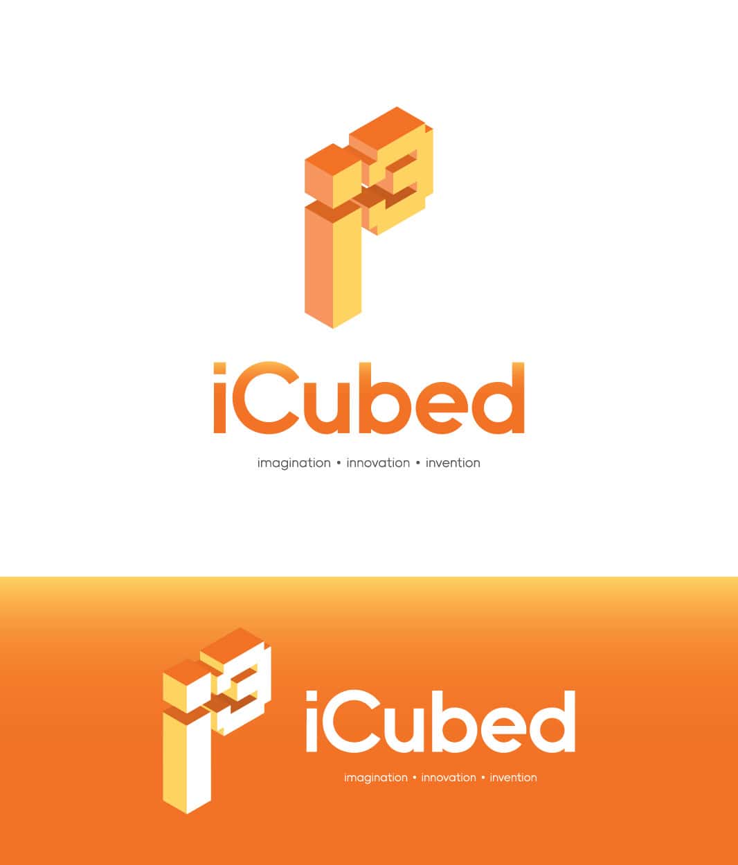
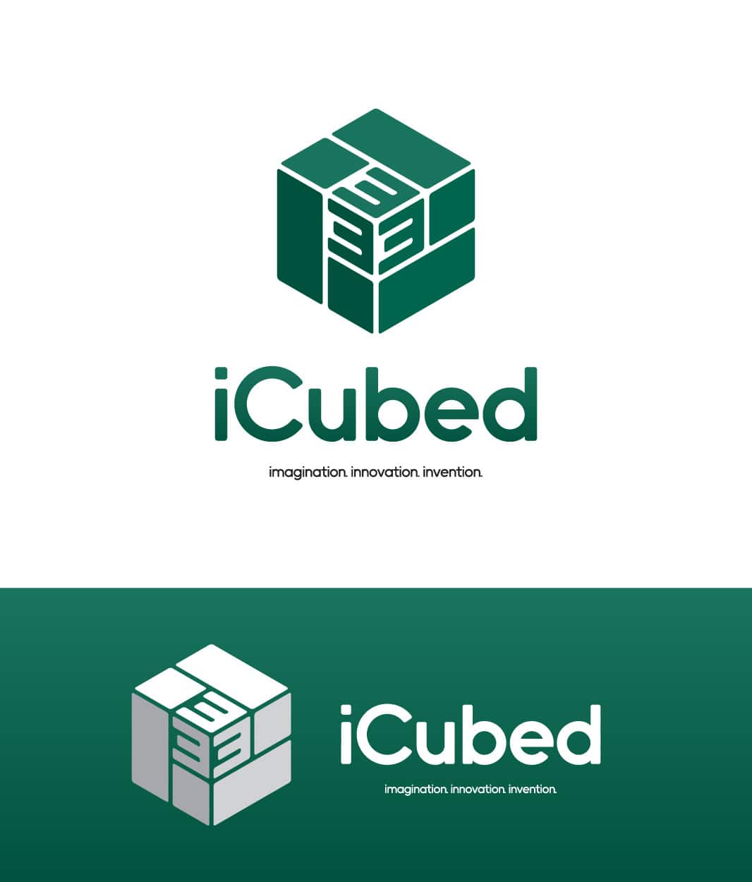
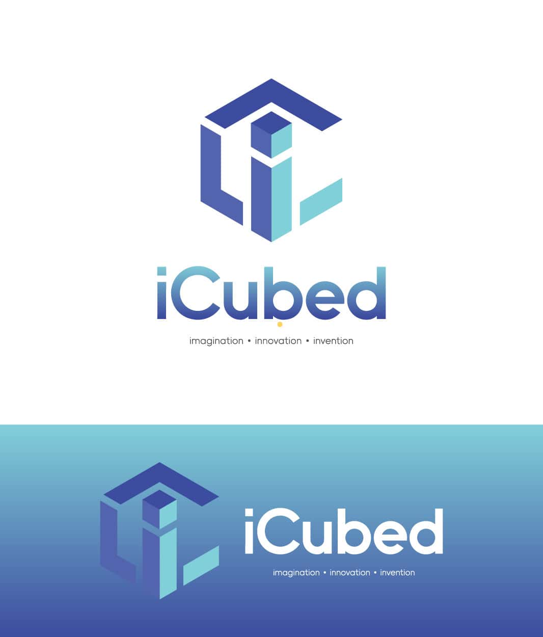
Three directions were explored, each built around the event’s three i’s of imagination, innovation, and invention. The concepts needed to bring in the retro gaming theme while still feeling polished enough to live inside Powerfleet’s brand system.
The goal was to make the identity feel modular, memorable, and fun while keeping it polished enough for an internal Powerfleet event.
Logo Concepts
Three directions were explored, each built around the event’s three i’s of imagination, innovation, and invention. The concepts needed to bring in the retro gaming theme while still feeling polished enough to live inside Powerfleet’s brand system.
The goal was to make the identity feel modular, memorable, and fun while keeping it polished enough for an internal Powerfleet event.
Final Decision
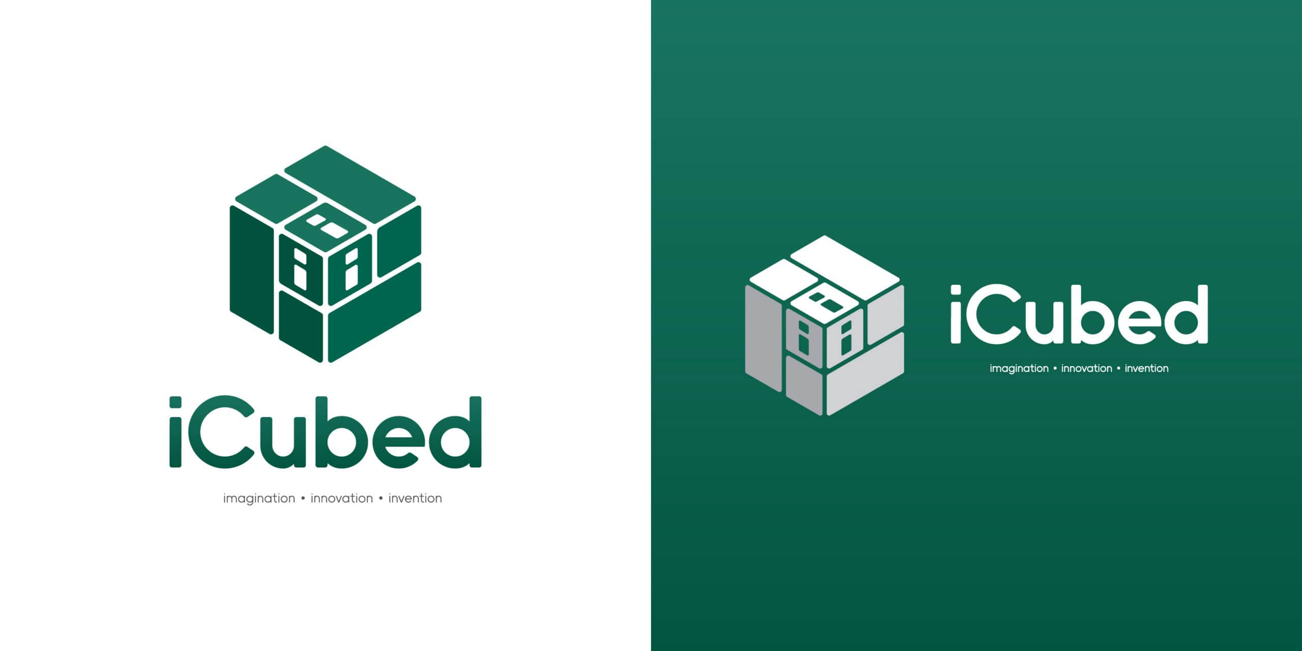
The green cube direction was selected and refined into the final identity. It gave the event a stronger sense of structure, tied clearly back to the three i’s, and worked best across the landing page, internal promotion, and supporting event materials.
Final Decision
The green cube direction was selected and refined into the final identity. It gave the event a stronger sense of structure, tied clearly back to the three i’s, and worked best across the landing page, internal promotion, and supporting event materials.
