
Harmony
2024
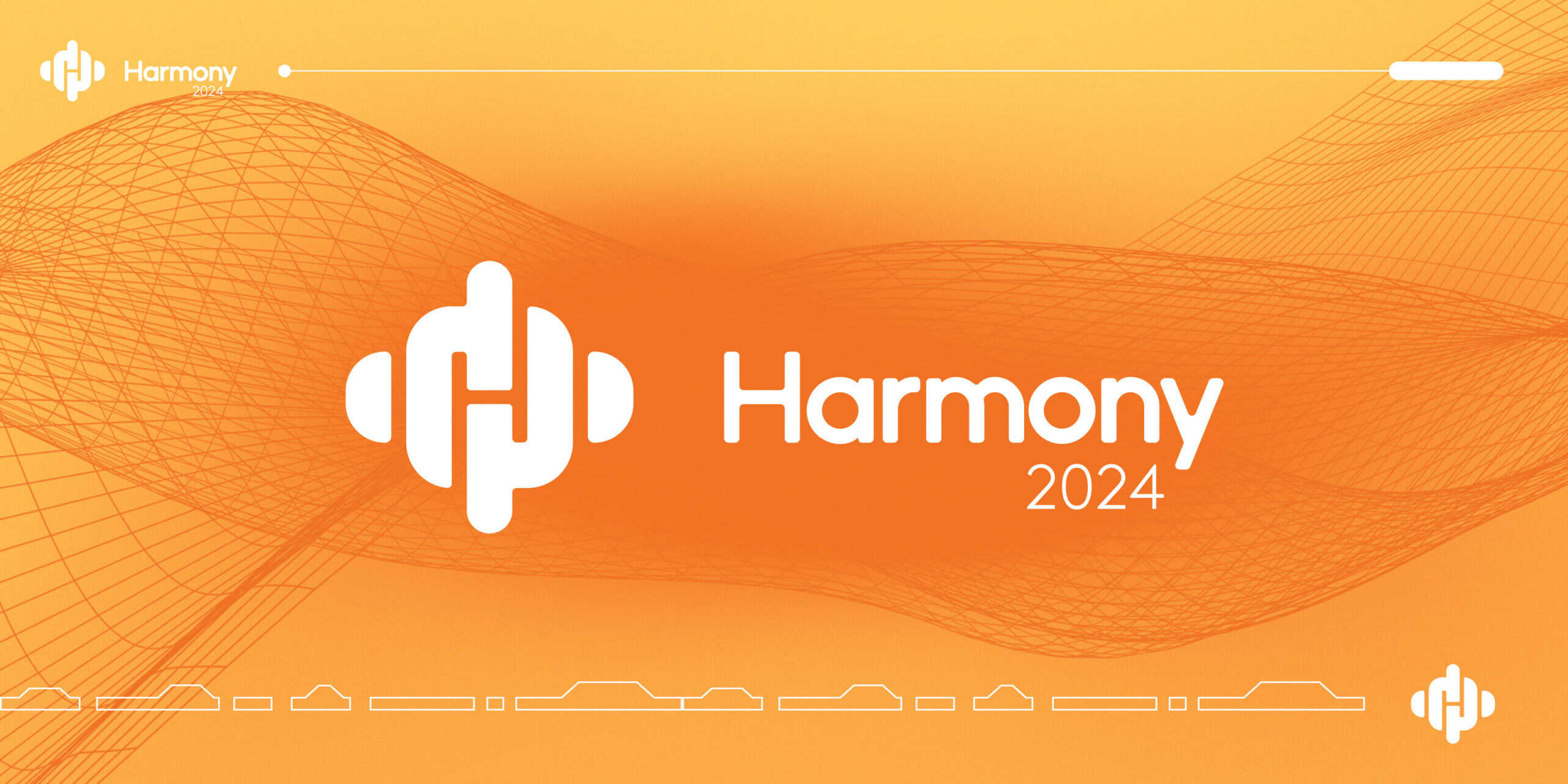
Harmony was Powerfleet’s first partner conference, held in Cape Town on the back of the MiX and Powerfleet merger. It was built to bring two newly combined companies and their partners into the same room, and the name carried the whole idea: growing relationships, new partnerships, and a business learning to move as one. The identity had to express that sense of coming together while still feeling like a clear part of the Powerfleet brand.
ROLE
Senior Graphic Designer, Powerfleet
SCOPE
Logo exploration, event identity direction
TOOLS
Illustrator, Photoshop
FOCUS
Identity design, concept development
Harmony 2024
Harmony was Powerfleet’s first partner conference, held in Cape Town on the back of the MiX and Powerfleet merger. It was built to bring two newly combined companies and their partners into the same room, and the name carried the whole idea: growing relationships, new partnerships, and a business learning to move as one. The identity had to express that sense of coming together while still feeling like a clear part of the Powerfleet brand.
ROLE
Senior Graphic Designer, Powerfleet
SCOPE
Logo exploration, event identity direction
TOOLS
Illustrator, Photoshop
FOCUS
Identity design, concept development
The Signal
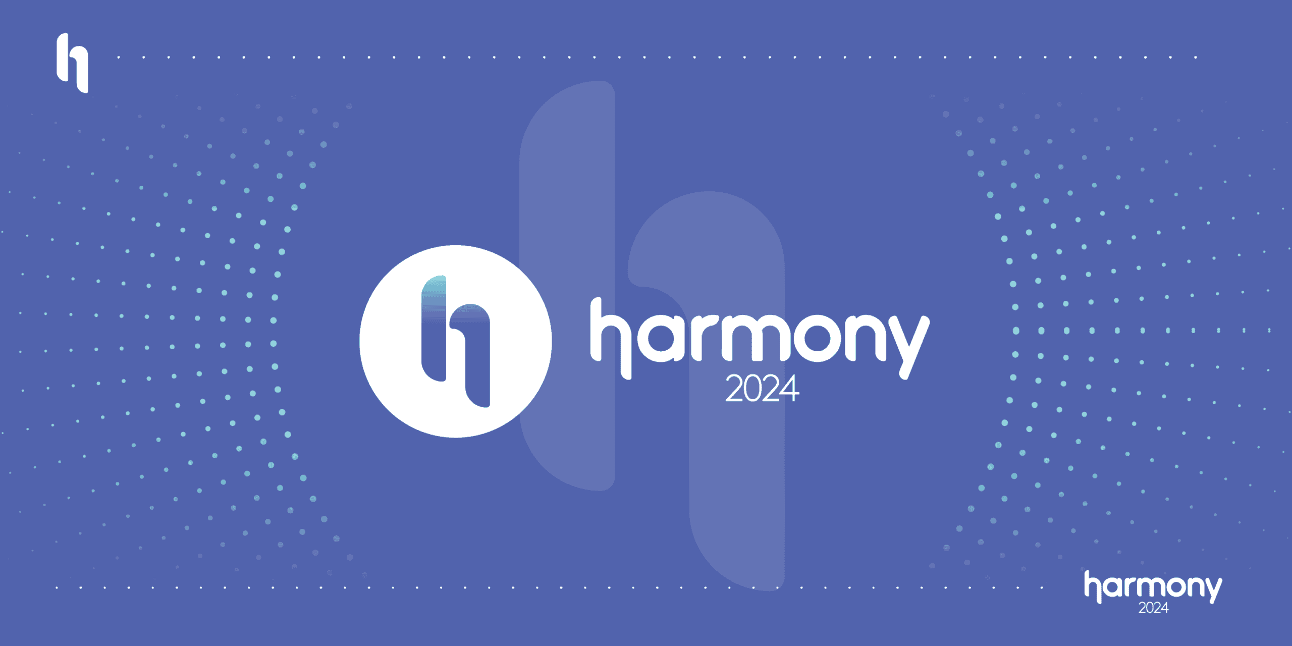
This was the direction that looked furthest ahead. The “H” is built as a signal that radiates outward, made to speak to partners about where Powerfleet was heading in the AI space and what the future held. It leaned tech-forward and partner-focused rather than event-decorative. The “H” could also stand on its own as a mark, ready to carry the identity across materials.
The Voice
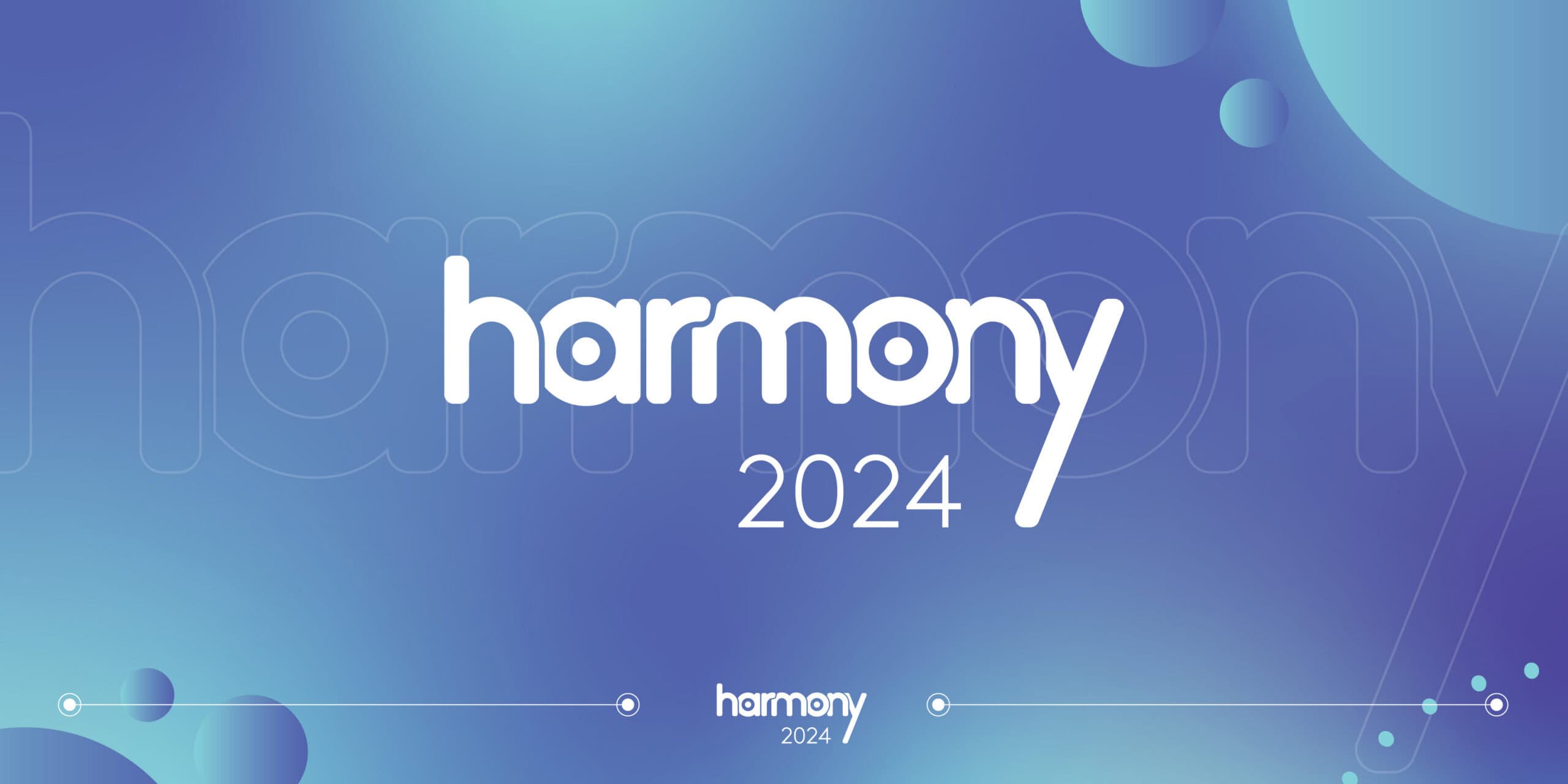
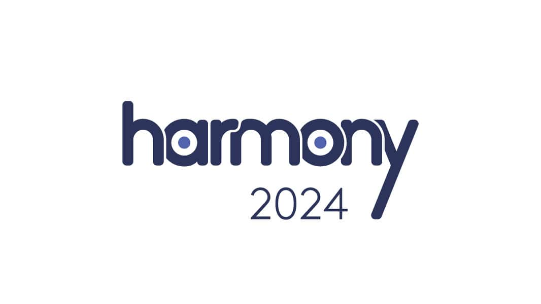
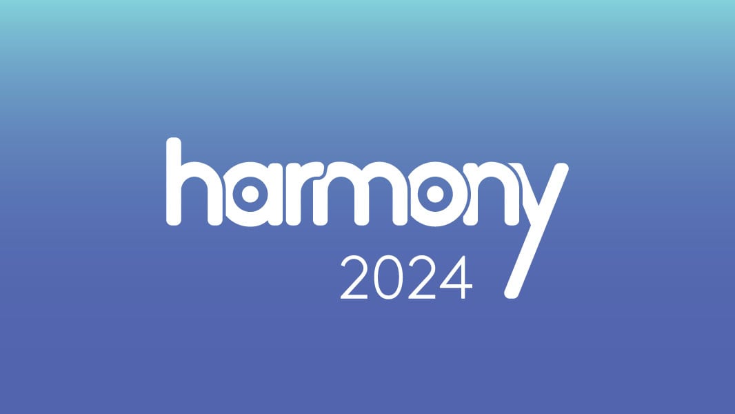
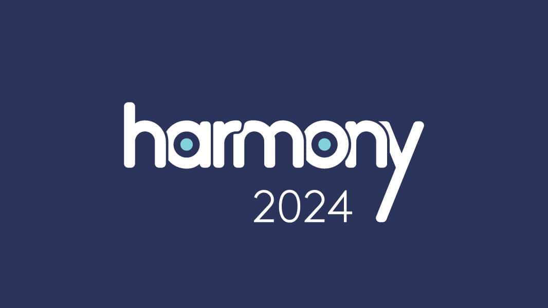
The most personable of the three. Here the name does the work: a soft, lowercase wordmark with an extended “y” that stretches into a gesture, giving it movement and warmth. It also carried a loose tie back to the parent brand, an optical nod worked into the “a” and the “o” that tips its hat to the Powerfleet mark without leaning on a literal lockup. The direction leaned into the relationship side of the conference, less about the technology and more about the people in the room.

The Monogram
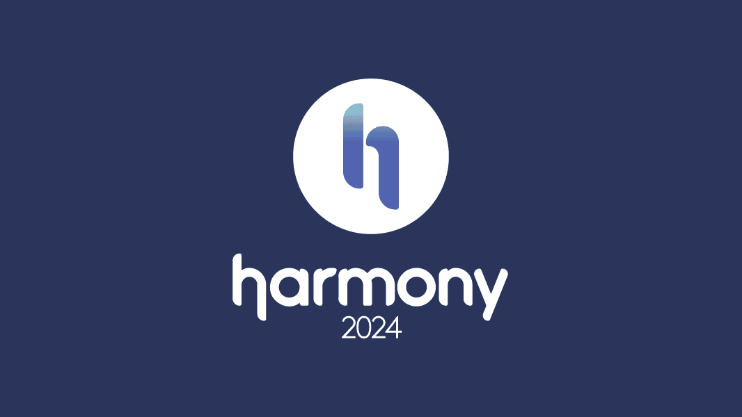
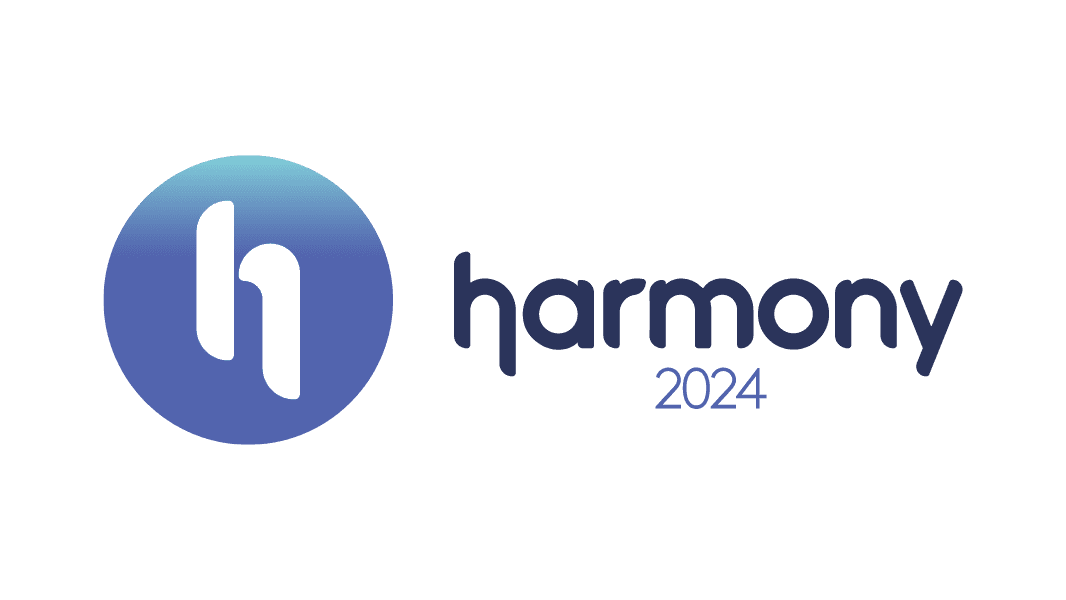
A more refined take on the name: an elevated wordmark paired with a standalone “h” monogram for the moments a full wordmark won’t fit. The circular “h” gave the identity a compact mark for avatars, app icons, and tight digital spaces, while the wordmark stayed the primary lockup. The most versatile of the three.
Final Decision
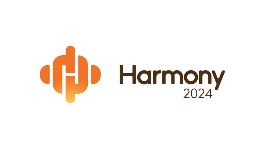
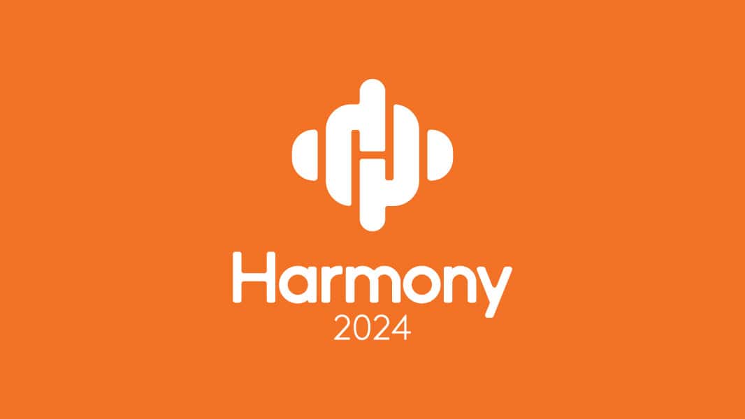
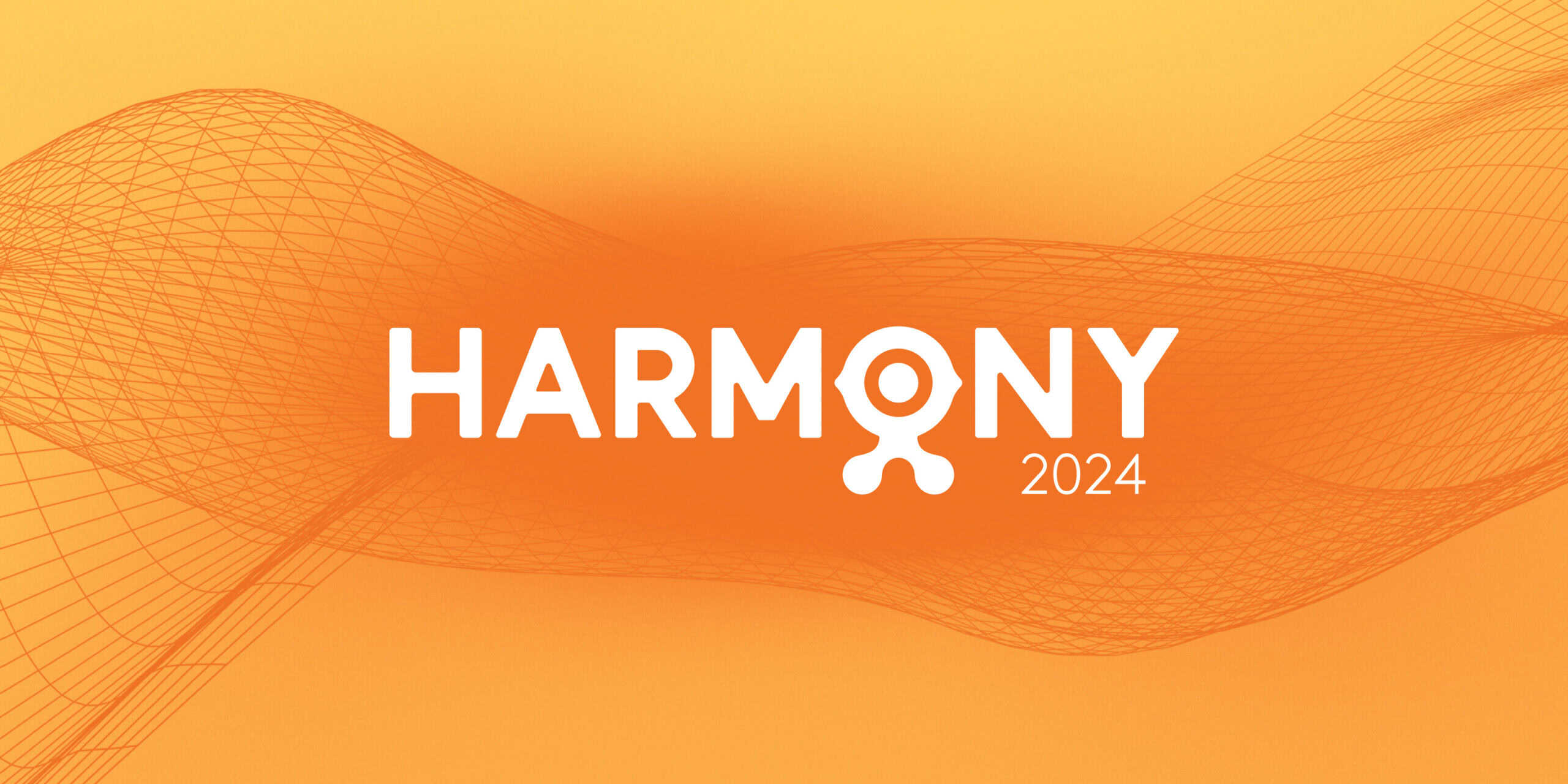
Left to my own preference, I’d have pushed the event toward a distinct identity that could stand on its own under the Powerfleet umbrella. Timing made the call. Coming straight off the merger, keeping the identity close to the existing brand kept recognition strong and gave partners a sense of continuity through the transition. Setting the Powerfleet mark into the Harmony wordmark did exactly that.
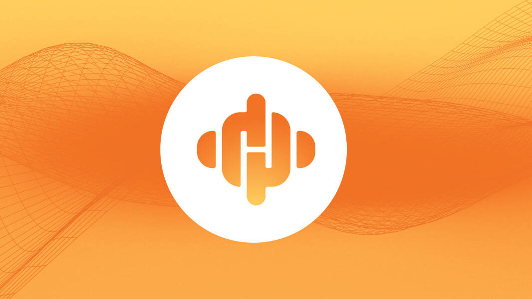
The Signal
This was the direction that looked furthest ahead. The “H” is built as a signal that radiates outward, made to speak to partners about where Powerfleet was heading in the AI space and what the future held. It leaned tech-forward and partner-focused rather than event-decorative. The “H” could also stand on its own as a mark, ready to carry the identity across materials.
The Voice
The most personable of the three. Here the name does the work: a soft, lowercase wordmark with an extended “y” that stretches into a gesture, giving it movement and warmth. It also carried a loose tie back to the parent brand, an optical nod worked into the “a” and the “o” that tips its hat to the Powerfleet mark without leaning on a literal lockup. The direction leaned into the relationship side of the conference, less about the technology and more about the people in the room.
The Monogram
A more refined take on the name: an elevated wordmark paired with a standalone “h” monogram for the moments a full wordmark won’t fit. The circular “h” gave the identity a compact mark for avatars, app icons, and tight digital spaces, while the wordmark stayed the primary lockup. The most versatile of the three.
Final Decision
Left to my own preference, I’d have pushed the event toward a distinct identity that could stand on its own under the Powerfleet umbrella. Timing made the call. Coming straight off the merger, keeping the identity close to the existing brand kept recognition strong and gave partners a sense of continuity through the transition. Setting the Powerfleet mark into the Harmony wordmark did exactly that.
