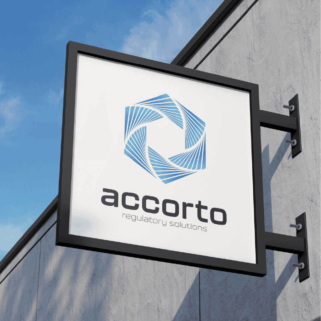
Accorto Regulatory Solutions needed a brand identity that could make complex compliance work feel clear, credible, and approachable.
As an independent FDA regulatory consulting firm, the business supported clients through demanding approval processes and highly technical requirements. The identity needed to communicate expertise without feeling overly clinical or institutional.
My role covered the full brand system, from early logo exploration and visual direction through typography, color, website design, and supporting business materials. The goal was to create a professional identity that could grow with the firm while remaining distinct within a crowded regulatory market.
ROLE
Freelance Brand Designer
TIMELINE
January 2022
TOOLS
Illustrator, Photoshop, WordPress
FOCUS
Logo design, brand system, website direction, launch materials
Accorto Regulatory Solutions
Accorto Regulatory Solutions needed a brand identity that could make complex compliance work feel clear, credible, and approachable.
As an independent FDA regulatory consulting firm, the business supported clients through demanding approval processes and highly technical requirements. The identity needed to communicate expertise without feeling overly clinical or institutional.
My role covered the full brand system, from early logo exploration and visual direction through typography, color, website design, and supporting business materials. The goal was to create a professional identity that could grow with the firm while remaining distinct within a crowded regulatory market.
ROLE
Freelance Brand Designer
TIMELINE
January 2022
TOOLS
Illustrator, Photoshop, WordPress
FOCUS
Logo design, brand system, website direction, launch materials
Accorto Regulatory Solutions needed a brand identity that could make complex compliance work feel clear, credible, and approachable.
As an independent FDA regulatory consulting firm, the business supported clients through demanding approval processes and highly technical requirements. The identity needed to communicate expertise without feeling overly clinical or institutional.
My role covered the full brand system, from early logo exploration and visual direction through typography, color, website design, and supporting business materials. The goal was to create a professional identity that could grow with the firm while remaining distinct within a crowded regulatory market.
ROLE
Freelance Brand Identity Designer
TIMELINE
January 2022
TOOLS
Illustrator, Photoshop, WordPress
FOCUS
Logo design, brand system, website direction, launch materials
Logo Concepts
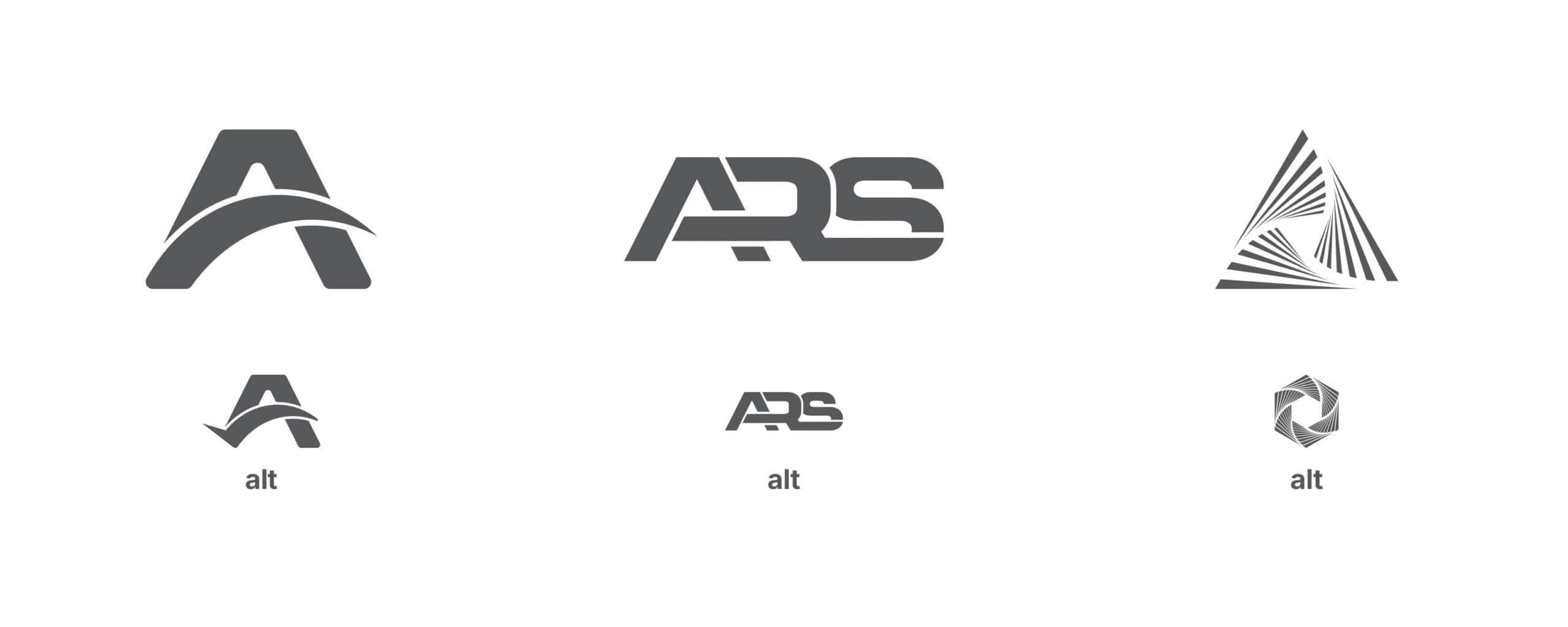
Early concepts explored a range of directions, including monogram-based marks, abstract letterforms, and more symbolic approaches.
Each route needed to balance authority with accessibility. The strongest concepts avoided the visual language of large institutions and pharmaceutical corporations, instead aiming for something more modern, independent, and adaptable.
The selected direction created a distinctive foundation that could stand on its own while supporting a broader visual system.
Logo Concepts
Early concepts explored a range of directions, including monogram-based marks, abstract letterforms, and more symbolic approaches.
Each route needed to balance authority with accessibility. The strongest concepts avoided the visual language of large institutions and pharmaceutical corporations, instead aiming for something more modern, independent, and adaptable.
The selected direction created a distinctive foundation that could stand on its own while supporting a broader visual system.

The Mark
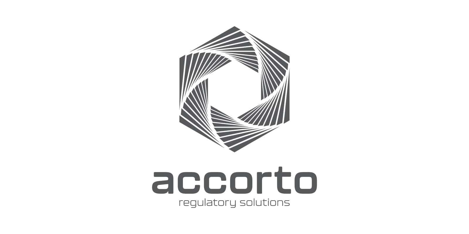
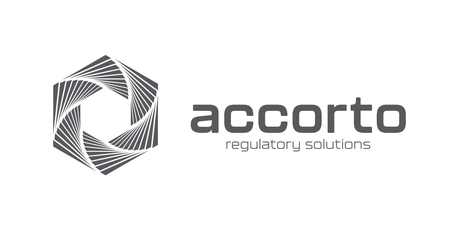
The final mark was built from a repeating geometric form that creates movement around a central space.
Its interlocking structure reflects the coordination required across complex regulatory processes, while the open center suggests clarity, focus, and a path forward. The shape also gives the identity a sense of momentum without relying on literal medical or compliance imagery.
The mark was designed to remain recognizable across a wide range of scales, from website navigation and social avatars to stationery and presentation materials.



Color Exploration
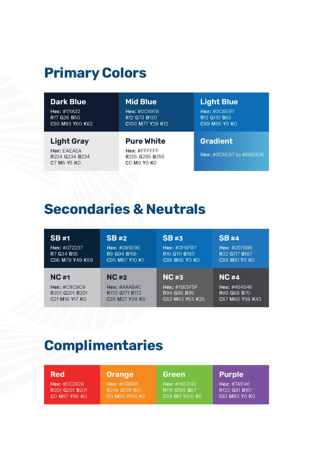
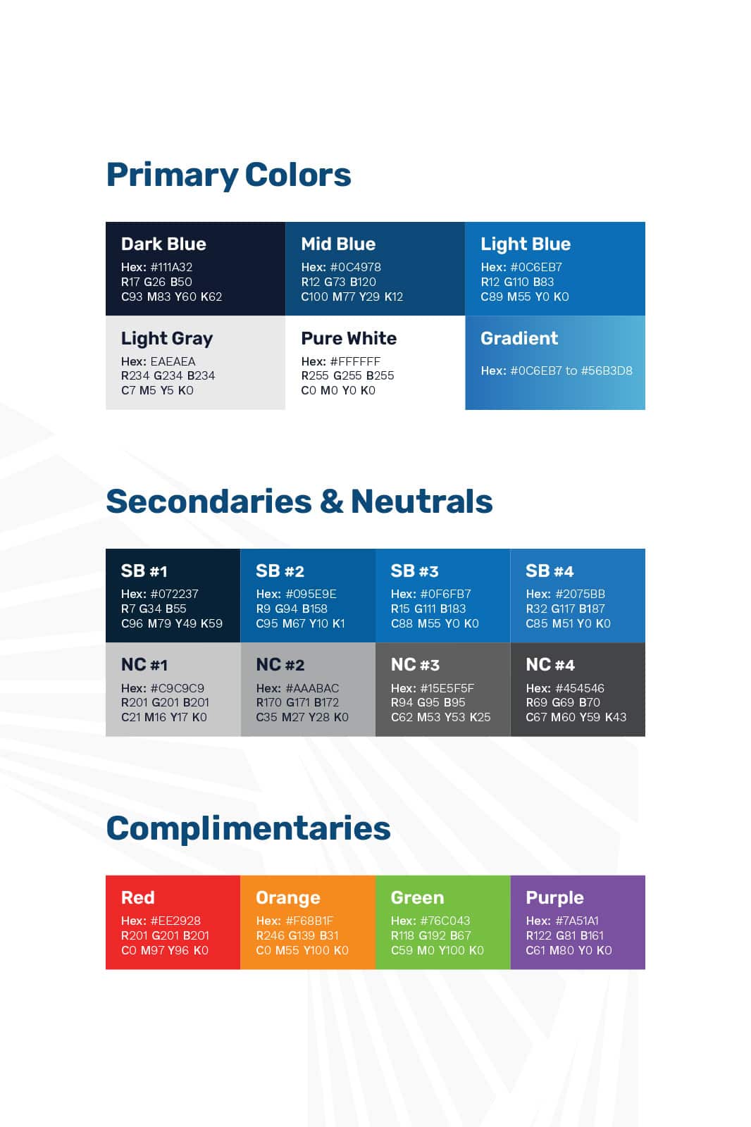
Several palette directions were explored to understand how color could shape the personality of the brand.
Warmer combinations brought energy but risked feeling too promotional, while brighter green options leaned too closely toward healthcare and sustainability. A cooler blue system ultimately offered the strongest balance of trust, clarity, and modernity.
The selected palette paired deep navy with brighter blues and restrained neutral tones, creating enough contrast for digital applications while maintaining the credibility expected within the regulatory space. As the brand evolved, orange was later introduced as an additional accent, adding warmth and flexibility without changing the original foundation.
The System
The brand system was designed to feel simple enough for everyday use while still offering enough range to support a growing business.
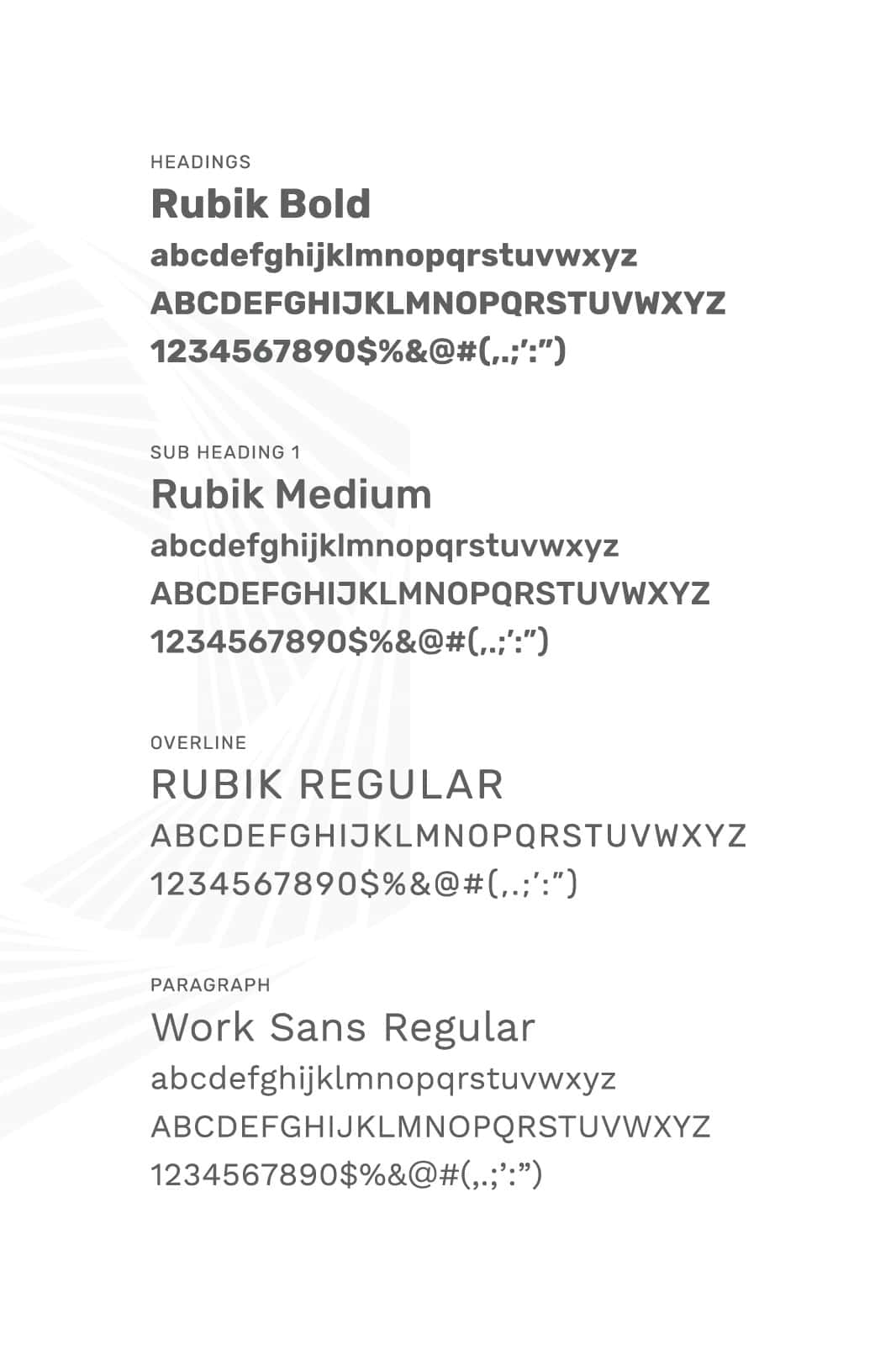
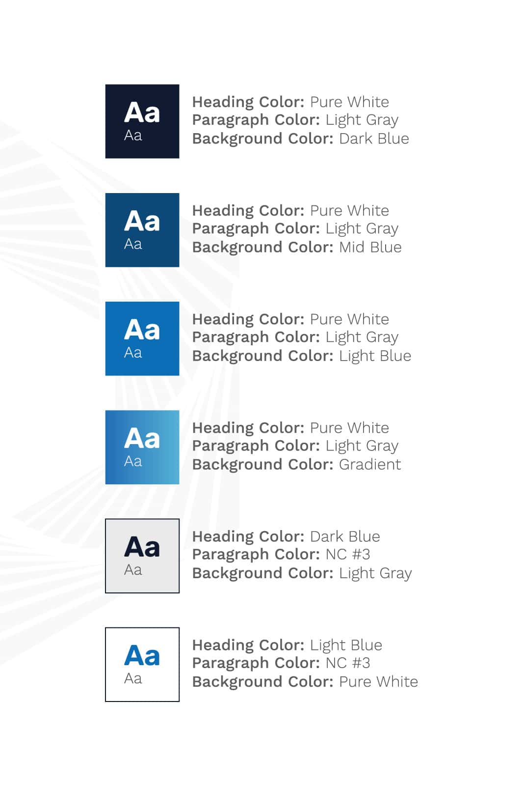
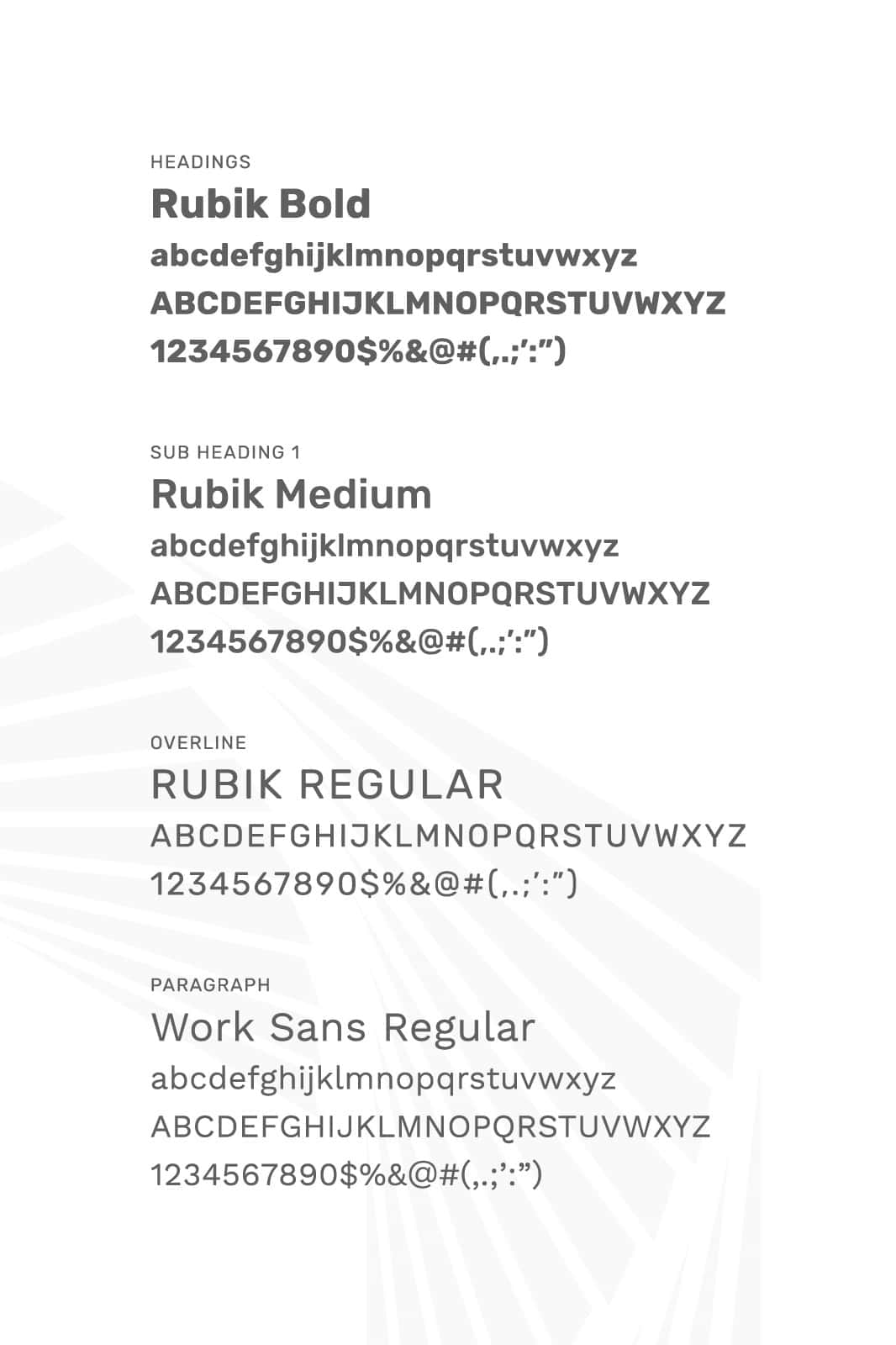
A navy foundation established authority, while brighter blues introduced energy and separation across layouts. Rubik was used for headings and Work Sans for supporting copy, creating a contemporary hierarchy that remained clear across web, print, and presentation formats.
Supporting graphic elements, gradients, spacing rules, and layout patterns helped extend the identity beyond the logo without overcomplicating the system.
Navy Foundation
A stable base color created consistency and reinforced trust.
Blue Accents
Brighter tones introduced contrast, energy, and clearer content organization.
Rubik & Work Sans
A structured but approachable type pairing supported both technical and client-facing communication.
In the Wild
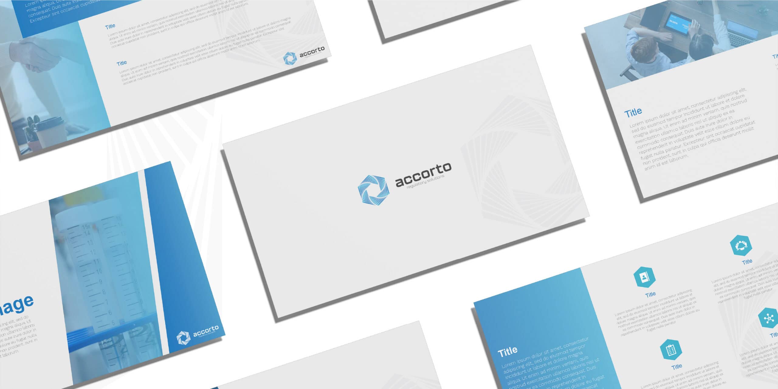
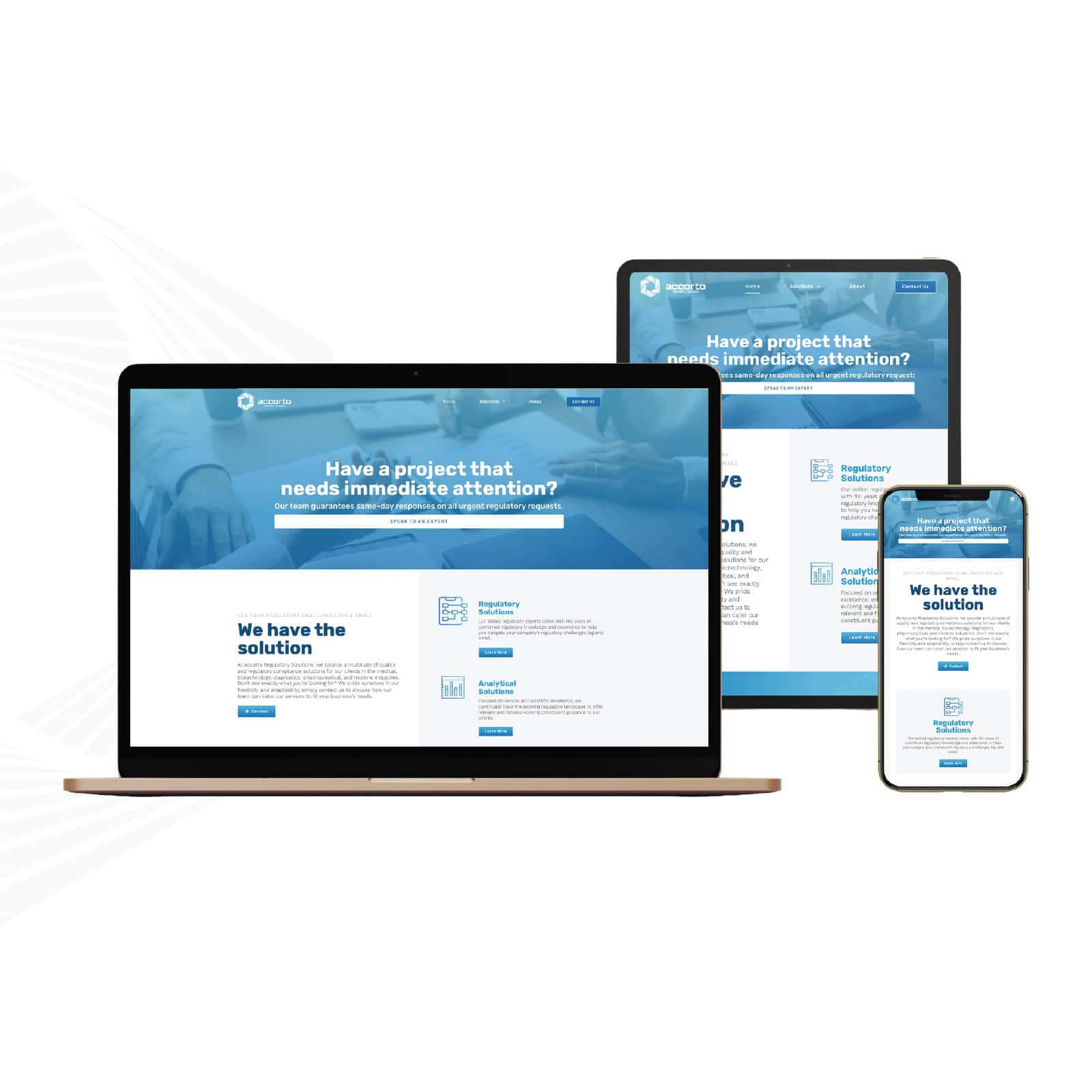
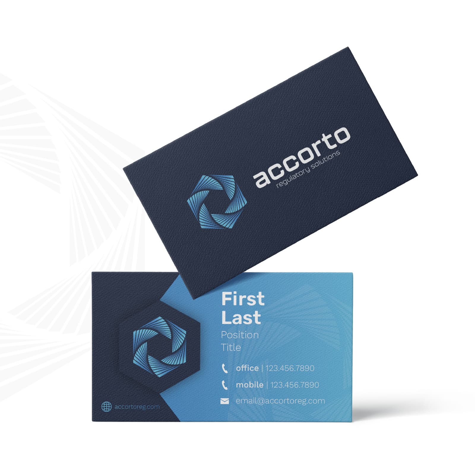
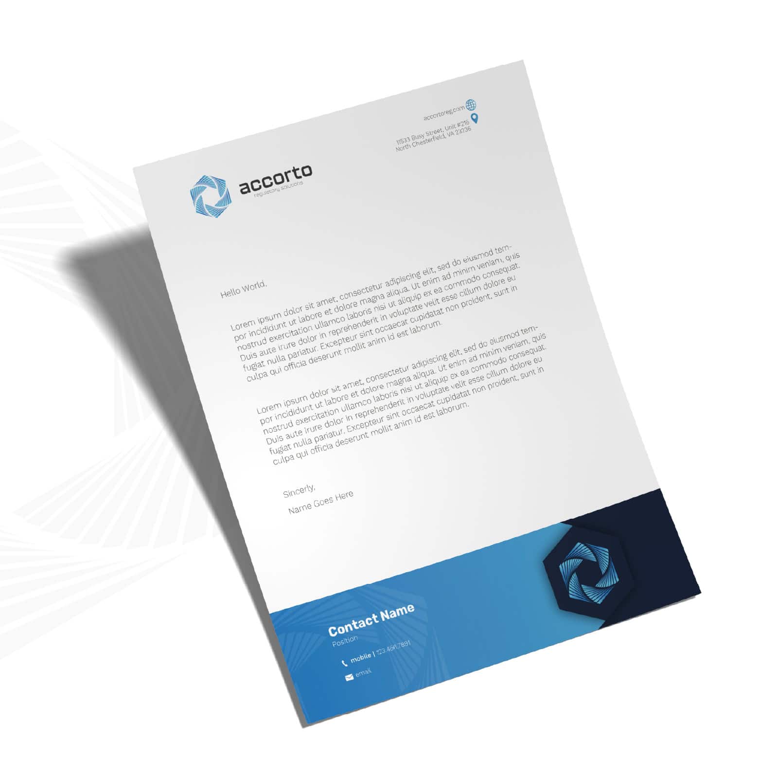
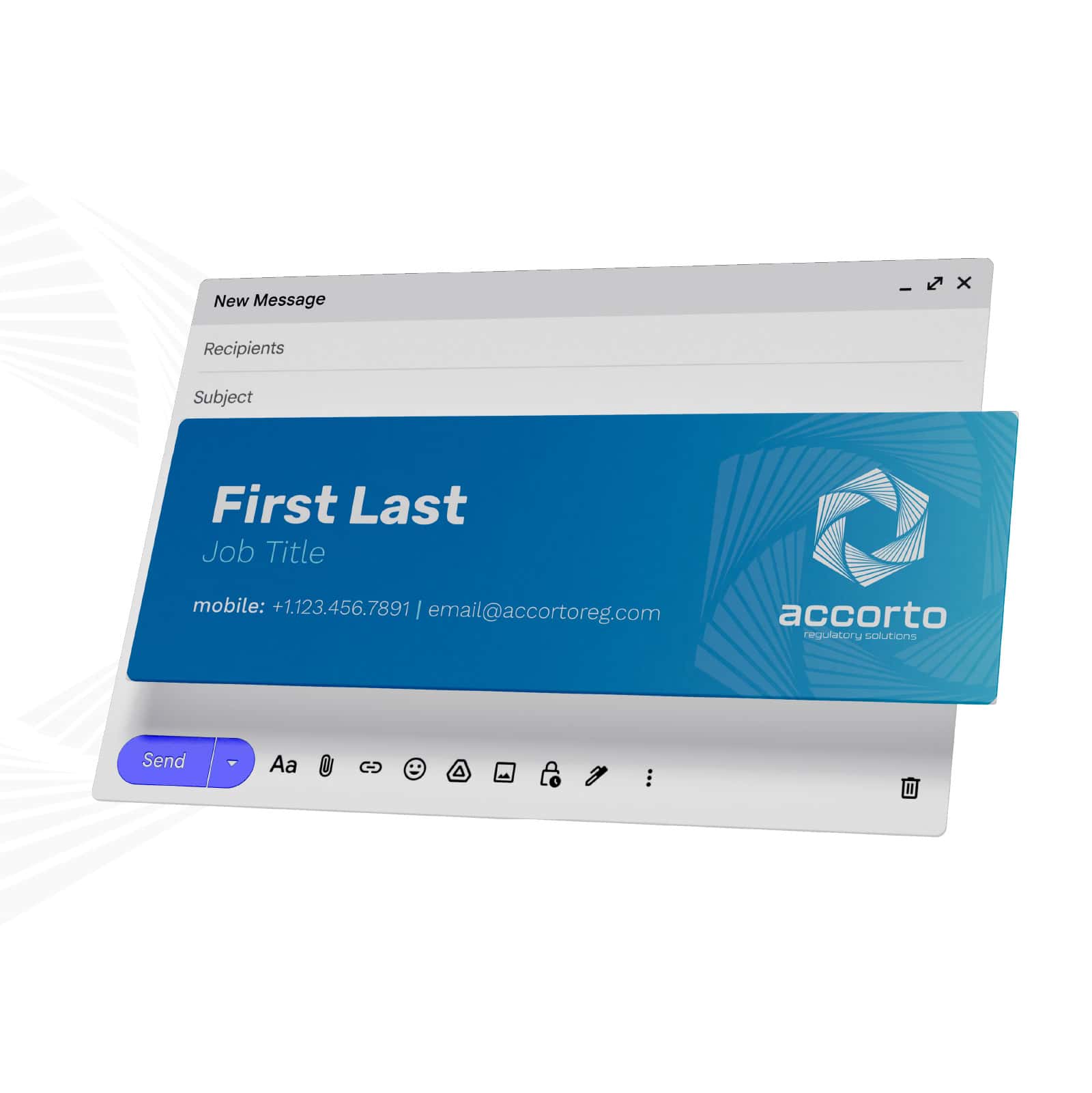
The identity was applied across the website, business cards, correspondence, presentation materials, email signatures, and other client-facing touchpoints.
Each application needed to feel professional without becoming overly formal. Consistent typography, restrained color use, and repeatable layout patterns helped the materials feel connected while leaving room for different types of content.
The website became the primary expression of the brand, translating the system into a clear digital experience that introduced the firm, explained its services, and gave potential clients an accessible path to contact.
The Mark
The final mark was built from a repeating geometric form that creates movement around a central space.
Its interlocking structure reflects the coordination required across complex regulatory processes, while the open center suggests clarity, focus, and a path forward. The shape also gives the identity a sense of momentum without relying on literal medical or compliance imagery.
The mark was designed to remain recognizable across a wide range of scales, from website navigation and social avatars to stationery and presentation materials.
Color Exporation
Several palette directions were explored to understand how color could shape the personality of the brand.
Warmer combinations brought energy but risked feeling too promotional, while brighter green options leaned too closely toward healthcare and sustainability. A cooler blue system ultimately offered the strongest balance of trust, clarity, and modernity.
The selected palette paired deep navy with brighter blues and restrained neutral tones, creating enough contrast for digital applications while maintaining the credibility expected within the regulatory space. As the brand evolved, orange was later introduced as an additional accent, adding warmth and flexibility without changing the original foundation.
The System
The brand system was designed to feel simple enough for everyday use while still offering enough range to support a growing business.
A navy foundation established authority, while brighter blues introduced energy and separation across layouts. Rubik was used for headings and Work Sans for supporting copy, creating a contemporary hierarchy that remained clear across web, print, and presentation formats.
Supporting graphic elements, gradients, spacing rules, and layout patterns helped extend the identity beyond the logo without overcomplicating the system.
Navy Foundation
A stable base color created consistency and reinforced trust.
Blue Accents
Brighter tones introduced contrast, energy, and clearer content organization.
Rubik & Work Sans
A structured but approachable type pairing supported both technical and client-facing communication.
In the Wild
The identity was applied across the website, business cards, correspondence, presentation materials, email signatures, and other client-facing touchpoints.
Each application needed to feel professional without becoming overly formal. Consistent typography, restrained color use, and repeatable layout patterns helped the materials feel connected while leaving room for different types of content.
The website became the primary expression of the brand, translating the system into a clear digital experience that introduced the firm, explained its services, and gave potential clients an accessible path to contact.