Powerfleet had grown through mergers, acquisitions, and expanding market needs. The brand was now supporting more teams, regions, platforms, and materials than the original system had been built to handle.
The evolution was a collaborative effort across Brand and Communications, Product Marketing, and Product. Product helped ensure alignment with the Unity platform where needed, particularly around typography. My role focused on helping lead the conversations, developing much of the supporting visual system, and designing the updated brand guidelines.
The goal was not to reinvent Powerfleet. It was to preserve what people already recognized while making the brand clearer, more flexible, and easier to apply consistently.
ROLE
Senior Graphic Designer, Powerfleet
TIMELINE
Initial rollout May 2025, ongoing evolution
TOOLS
Illustrator, InDesign, Photoshop, Adobe XD, Figma
FOCUS
Brand evolution, visual system, guidelines, cross-functional collaboration
Powerfleet’s Brand Evolution
Powerfleet had grown through mergers, acquisitions, and expanding market needs. The brand was now supporting more teams, regions, platforms, and materials than the original system had been built to handle.
The evolution was a collaborative effort across Brand and Communications, Product Marketing, and Product. Product helped ensure alignment with the Unity platform where needed, particularly around typography. My role focused on helping lead the conversations, developing much of the supporting visual system, and designing the updated brand guidelines.
The goal was not to reinvent Powerfleet. It was to preserve what people already recognized while making the brand clearer, more flexible, and easier to apply consistently.
ROLE
Senior Graphic Designer, Powerfleet
TIMELINE
Initial rollout May 2025, ongoing evolution
TOOLS
Illustrator, InDesign, Photoshop, Adobe XD, Figma
FOCUS
Brand evolution, visual system, guidelines, cross-functional collaboration
Powerfleet had grown through mergers, acquisitions, and expanding market needs. The brand was now supporting more teams, regions, platforms, and materials than the original system had been built to handle.
The evolution was a collaborative effort across Brand and Communications, Product Marketing, and Product. Product helped ensure alignment with the Unity platform where needed, particularly around typography. My role focused on helping lead the conversations, developing much of the supporting visual system, and designing the updated brand guidelines.
The goal was not to reinvent Powerfleet. It was to preserve what people already recognized while making the brand clearer, more flexible, and easier to apply consistently.
ROLE
Senior Graphic Designer, Powerfleet
TIMELINE
Initial rollout May 2025, ongoing evolution
TOOLS
Illustrator, InDesign, Photoshop, Adobe XD, Figma
FOCUS
Brand evolution, visual system, guidelines, cross-functional collaboration
What Needed to Evolve
The identity remained recognizable, but the system around it had not kept pace with the volume and variety of work being produced. As more teams and regions created materials, inconsistencies became increasingly visible.
Dated typography
Century Gothic no longer reflected the tone of a modern technology company. Internally, it had even earned comparisons to a funeral home.
Rogue color usage
New colors were appearing without shared guidance, making individual campaigns feel disconnected from the broader brand.
Inconsistent hierarchy
Headings, subheadings, and body copy lacked clearly defined roles, making layouts harder to scan and difficult to repeat consistently.
What Needed to Evolve
The identity remained recognizable, but the system around it had not kept pace with the volume and variety of work being produced. As more teams and regions created materials, inconsistencies became increasingly visible.
Dated typography
Century Gothic no longer reflected the tone of a modern technology company. Internally, it had even earned comparisons to a funeral home.
Rogue color usage
New colors were appearing without shared guidance, making individual campaigns feel disconnected from the broader brand.
Inconsistent hierarchy
Headings, subheadings, and body copy lacked clearly defined roles, making layouts harder to scan and difficult to repeat consistently.
Typography
Typography offered a clear opportunity to modernize the brand while creating stronger alignment between marketing and the Unity platform.
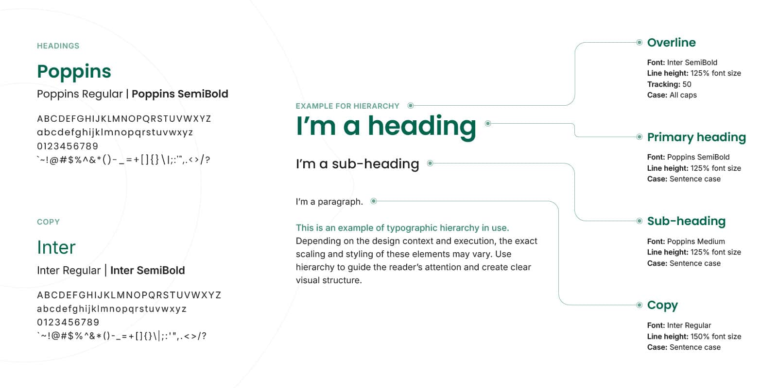
The cross-functional team aligned on Poppins for headings and Inter for supporting copy. The combination felt more contemporary while remaining practical across digital, print, presentation, product-aligned, and event applications.
The system also introduced clearer roles for overlines, primary headings, subheadings, and body copy. Recommended weights, capitalization, and spacing gave designers more flexibility without losing consistency.
Color
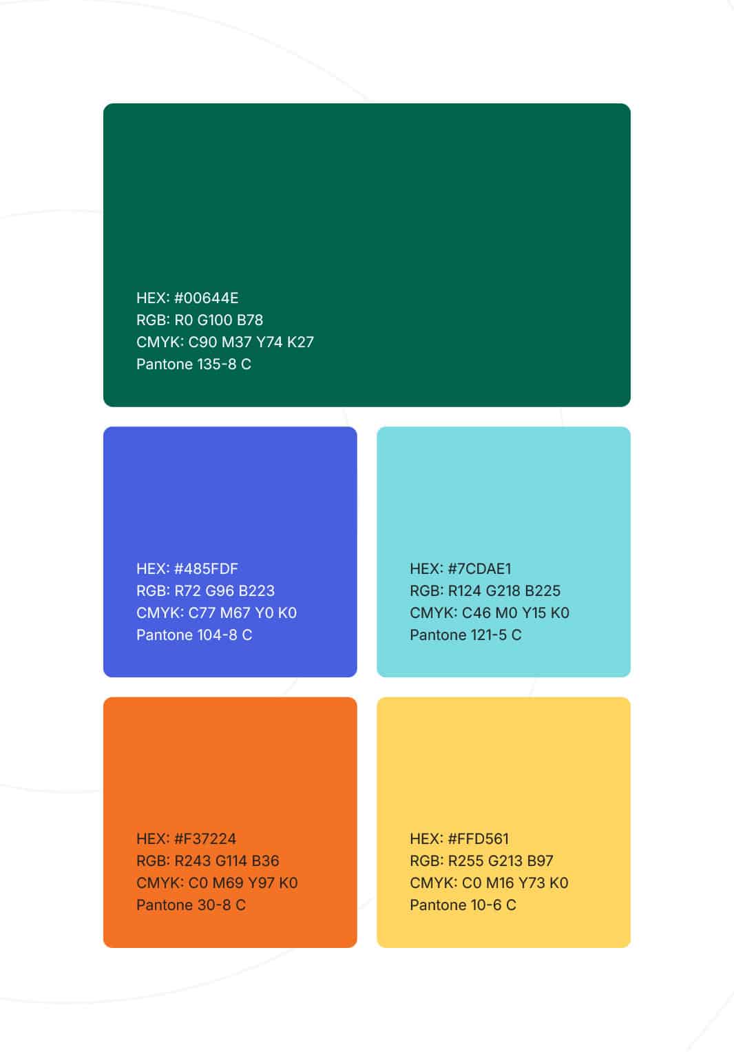
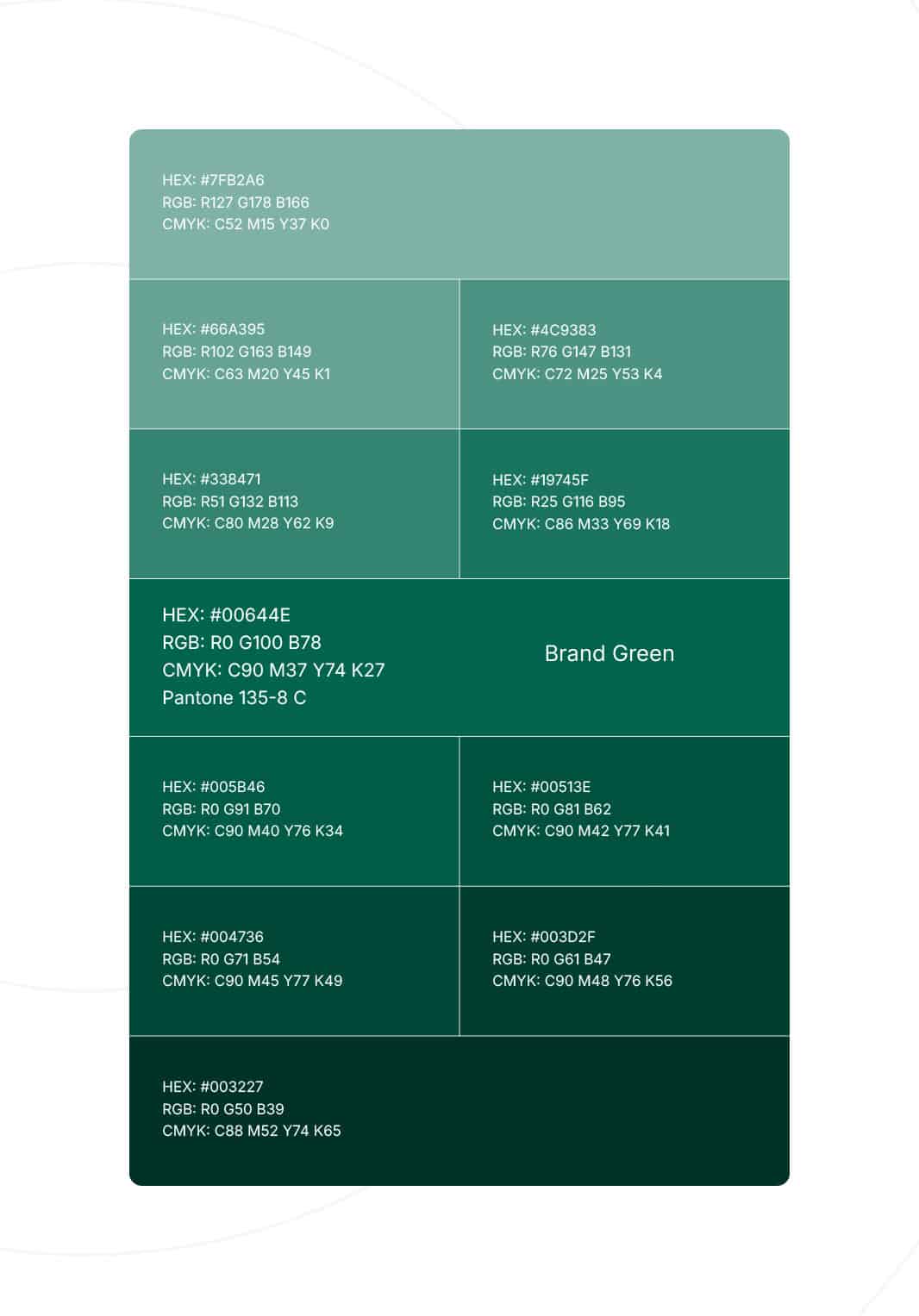
Powerfleet green remained the anchor of the identity, but the system needed more range. Heavy reliance on a narrow palette made campaigns feel repetitive, while one-off color decisions contributed to the rogue usage people had begun to notice.
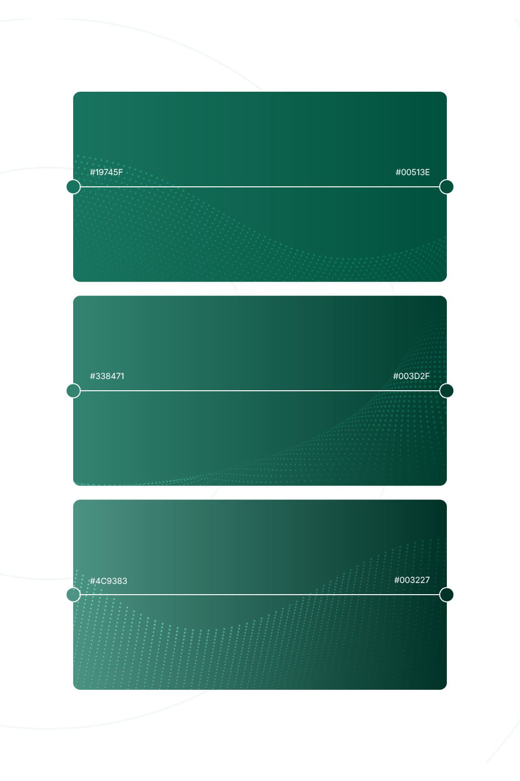
The expanded palette introduced supporting and accent colors for campaigns, events, data visualization, and regional materials. Additional green values created more depth within familiar brand applications, while gradients and data-inspired textures gave materials greater dimension and helped modernize the overall feel of the identity.
Clearer guidance around dominant, supporting, and accent colors allowed materials to respond to different audiences and formats while remaining recognizably Powerfleet.
Typography
Typography offered a clear opportunity to modernize the brand while creating stronger alignment between marketing and the Unity platform.
The cross-functional team aligned on Poppins for headings and Inter for supporting copy. The combination felt more contemporary while remaining practical across digital, print, presentation, product-aligned, and event applications.
The system also introduced clearer roles for overlines, primary headings, subheadings, and body copy. Recommended weights, capitalization, and spacing gave designers more flexibility without losing consistency.
The Guidelines
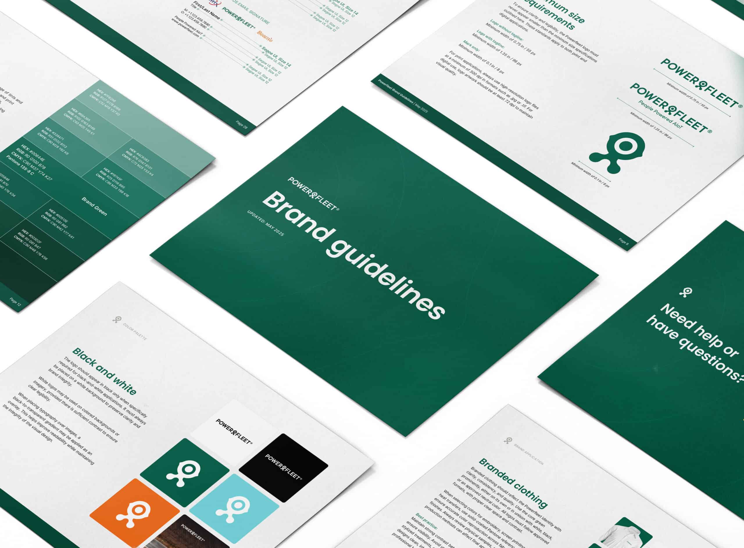
The updated guidelines were designed as a practical working resource rather than a purely visual presentation.
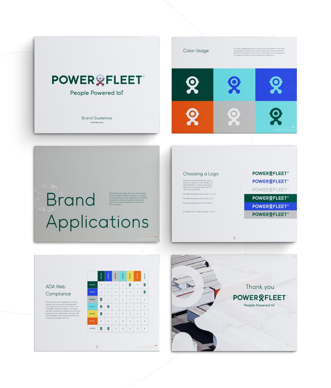
They brought typography, color, hierarchy, imagery, graphic elements, and real application examples into one shared system. The content was structured to show not only which elements to use, but how they should work together across different formats.
The direction was shaped through input from the teams involved. My primary ownership was the design and organization of the guide, the development of much of the supporting visual language, and the translation of those decisions into a resource others could confidently apply.
The guide was also built to evolve. New patterns and examples could be added as the system was tested through campaigns, regional materials, events, and other real-world applications.
Color
Powerfleet green remained the anchor of the identity, but the system needed more range. Heavy reliance on a narrow palette made campaigns feel repetitive, while one-off color decisions contributed to the rogue usage people had begun to notice.
The expanded palette introduced supporting and accent colors for campaigns, events, data visualization, and regional materials. Additional green values created more depth within familiar brand applications, while gradients and data-inspired textures gave materials greater dimension and helped modernize the overall feel of the identity.
Clearer guidance around dominant, supporting, and accent colors allowed materials to respond to different audiences and formats while remaining recognizably Powerfleet.
Applied Across the Brand
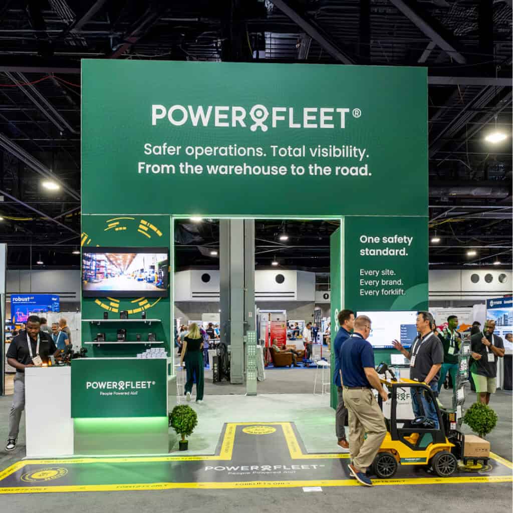
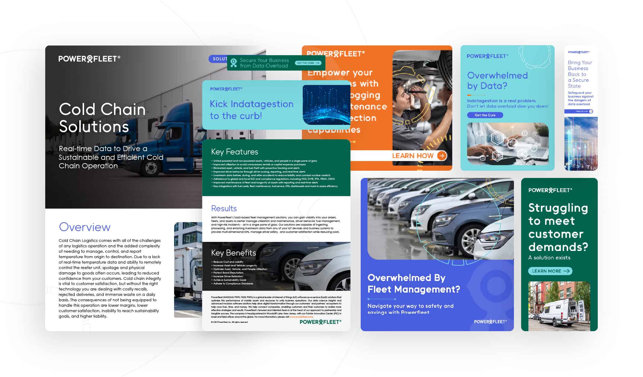
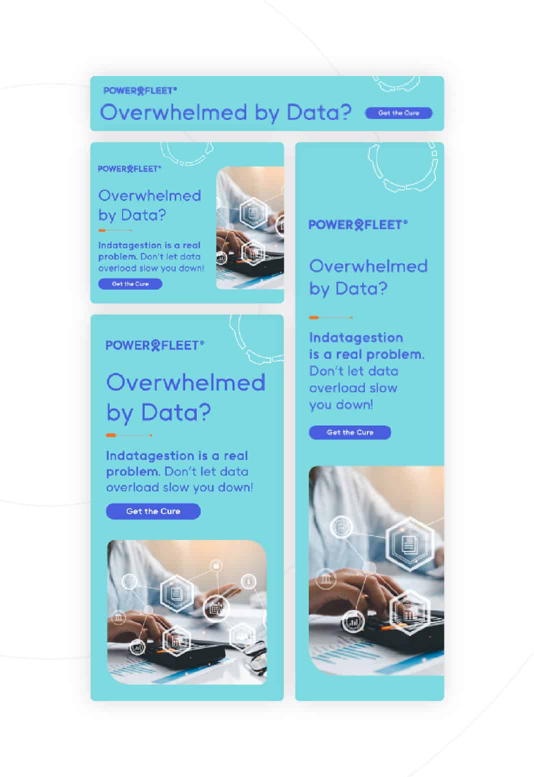
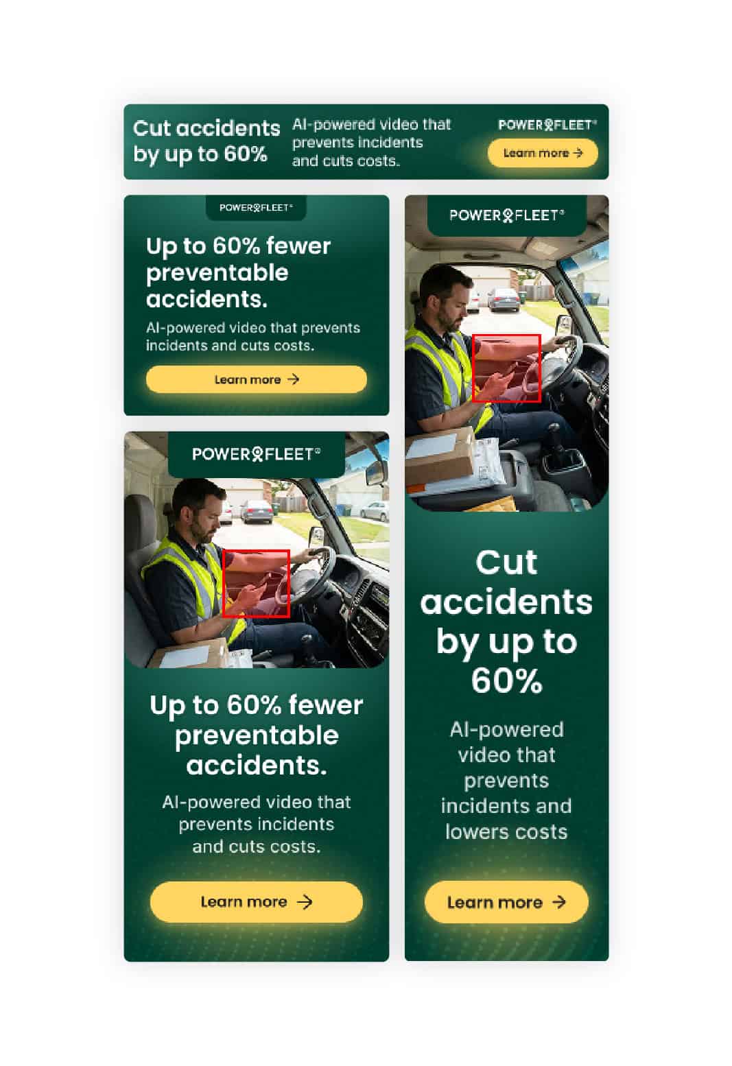
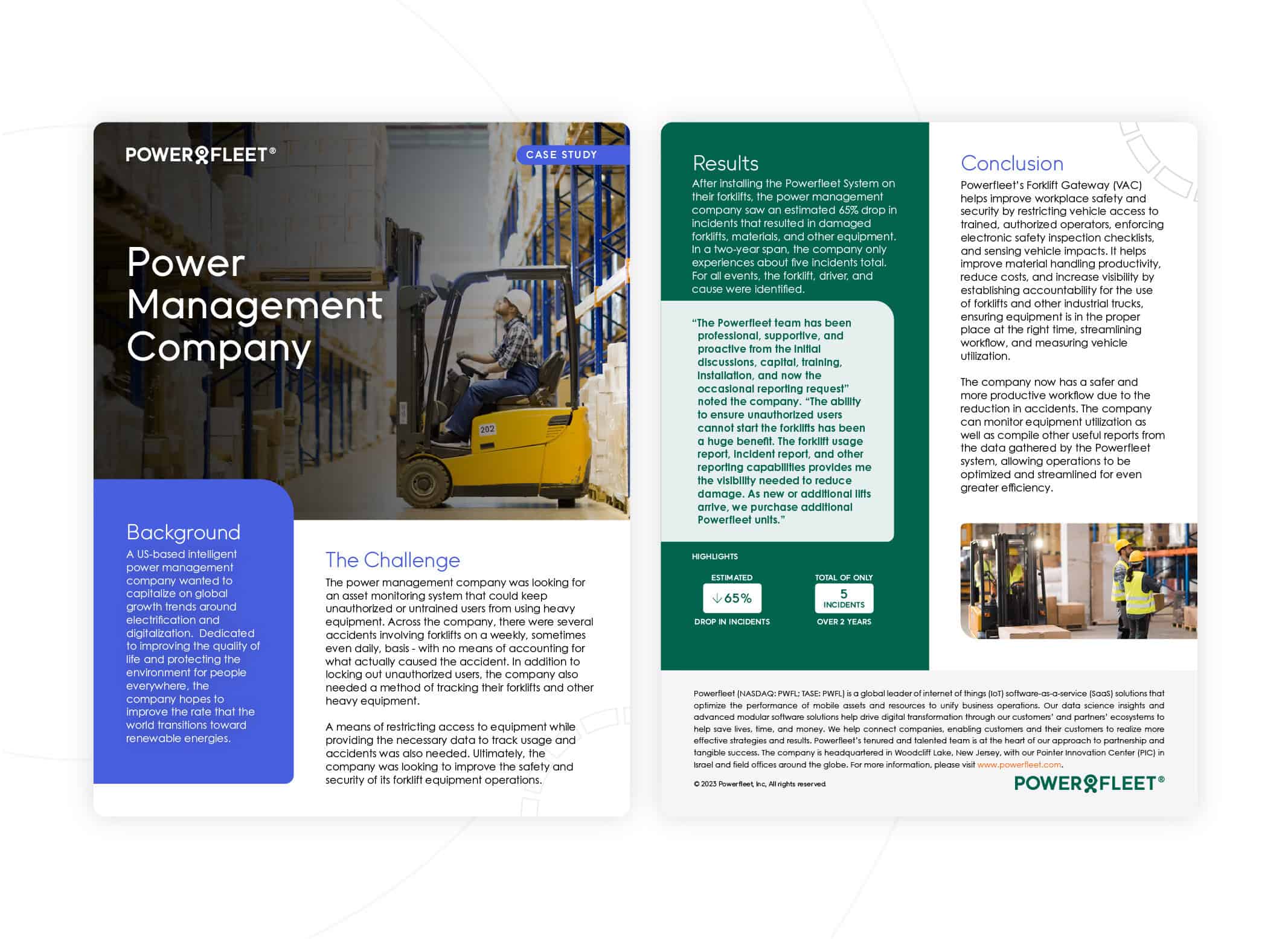
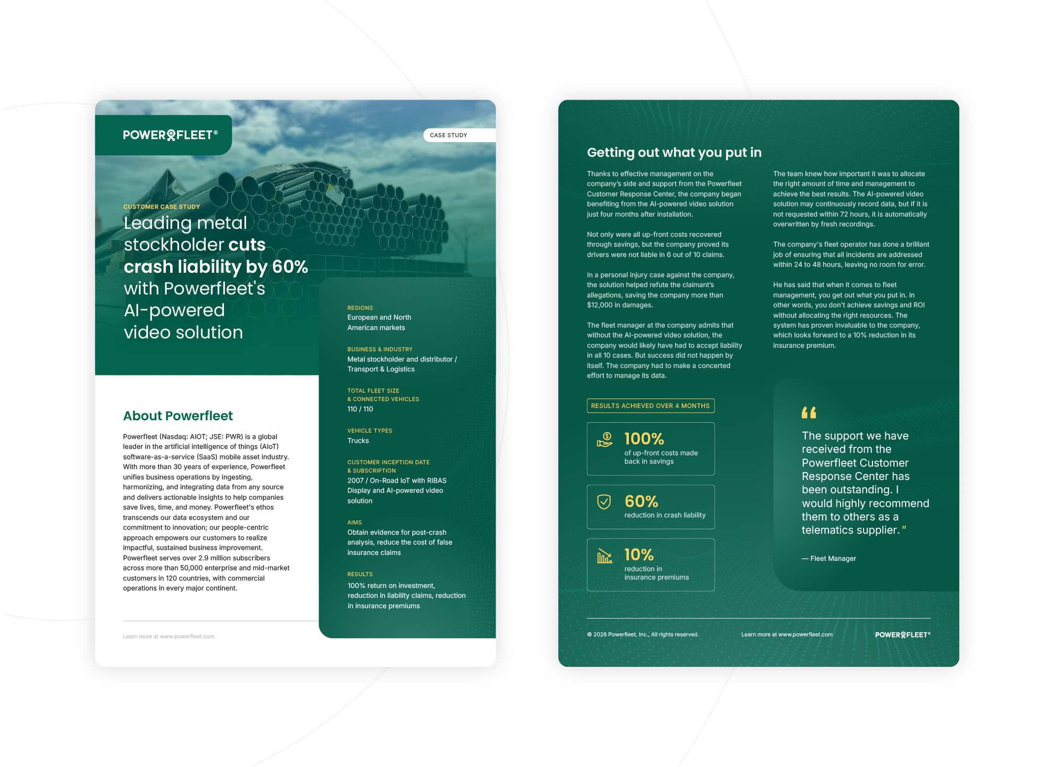
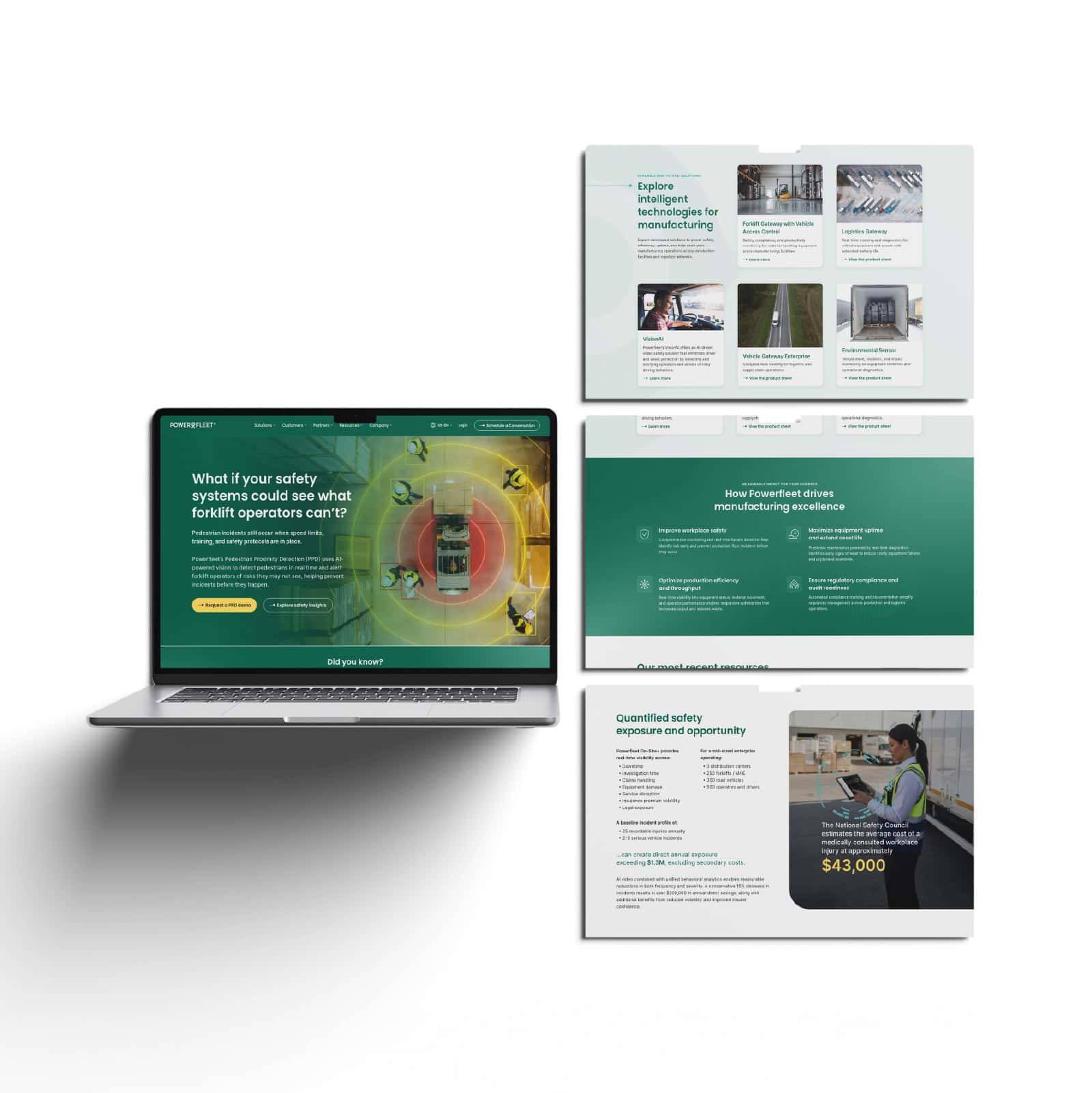
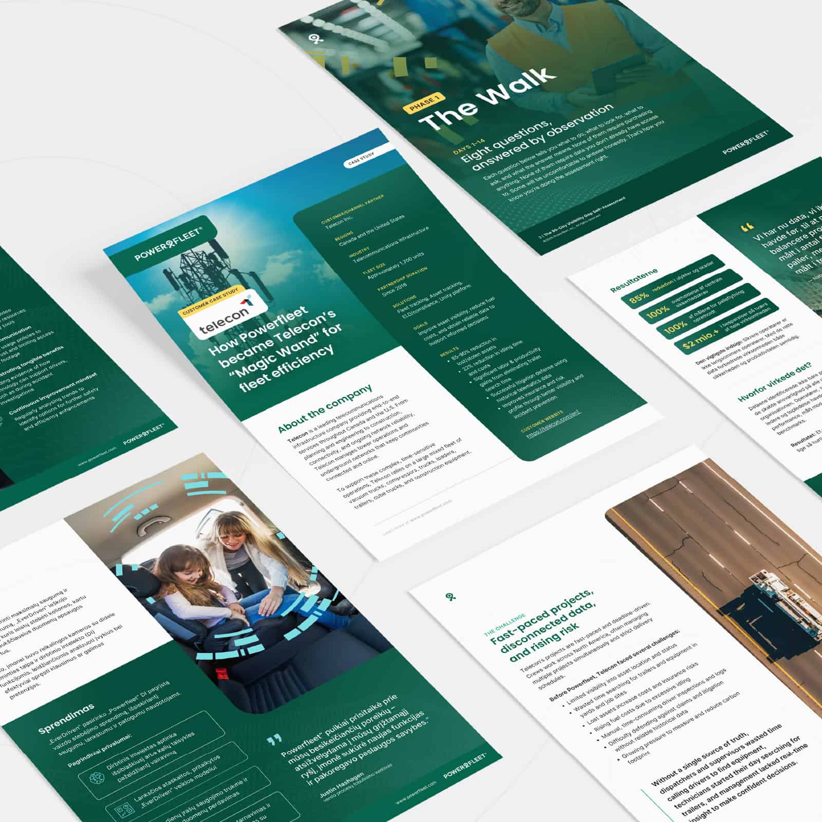
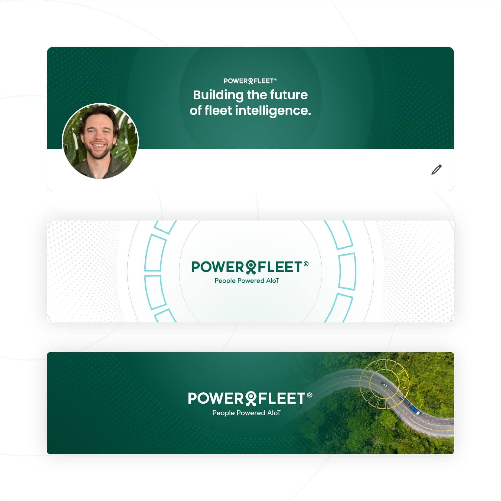
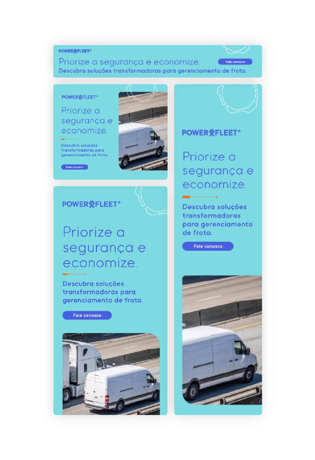
The updated system was carried into campaigns, sales materials, event graphics, social content, presentations, digital advertising, email communications, and regional marketing.
Rather than forcing every asset into one rigid template, it created a shared visual language that could adapt across teams and formats.
Breathing Room
Layouts became less crowded, allowing typography, imagery, and messaging to establish clearer priorities.
Stronger Hierarchy
A more defined type system made complex information easier to scan across campaign, sales, and event materials.
Less guesswork
Shared guidance around color, layout, and supporting elements gave internal teams and external partners a clearer starting point.

The Guidelines
The updated guidelines were designed as a practical working resource rather than a purely visual presentation.
They brought typography, color, hierarchy, imagery, graphic elements, and real application examples into one shared system. The content was structured to show not only which elements to use, but how they should work together across different formats.
The direction was shaped through input from the teams involved. My primary ownership was the design and organization of the guide, the development of much of the supporting visual language, and the translation of those decisions into a resource others could confidently apply.
The guide was also built to evolve. New patterns and examples could be added as the system was tested through campaigns, regional materials, events, and other real-world applications.
Applied Across the Brand
The updated system was carried into campaigns, sales materials, event graphics, social content, presentations, digital advertising, email communications, and regional marketing.
Rather than forcing every asset into one rigid template, it created a shared visual language that could adapt across teams and formats.
Breathing Room
Layouts became less crowded, allowing typography, imagery, and messaging to establish clearer priorities.
Stronger Hierarchy
A more defined type system made complex information easier to scan across campaign, sales, and event materials.
Less guesswork
Shared guidance around color, layout, and supporting elements gave internal teams and external partners a clearer starting point.